
Before and After Logo Redesigns: Case Studies and What Made Them Work
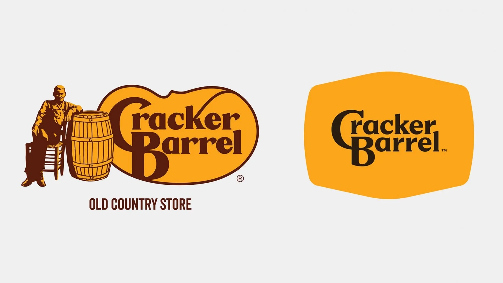
The infamous Cracker Barrel logo redesign that sparked debate quickly online
A logo redesign is one of the most visible decisions a brand can make. Get it right and it signals growth, confidence, and intention. Get it wrong and you end up trending for the wrong reasons — or quietly losing the recognition you spent years building.
What separates a successful logo redesign from a failed one rarely comes down to aesthetic preference. It comes down to clarity of purpose, respect for what already works, and execution that holds up across every context where the logo appears.
This post walks through real before-and-after logo redesign case studies — what changed, what stayed, why the decisions were made, and what small businesses can take from each transformation.
What actually drives a logo redesign
Brands rarely redesign their logos on a whim. The most successful rebrands are driven by one of a handful of legitimate business reasons:
The business has evolved. A logo designed for a local bakery doesn't scale to a regional chain. A mark built for print doesn't hold up as a 32-pixel favicon. When the business outgrows the identity, the identity needs to catch up.
The logo doesn't work in digital contexts. Detailed, multi-element logos that look fine on a business card become illegible at small sizes. The shift to mobile-first, icon-heavy digital environments has made simplification the most common driver of modern logo updates.
The visual style has become dated. Design ages. Logos that felt fresh in 2005 often carry visual cues — bevels, drop shadows, complex gradients — that now read as old-fashioned regardless of the brand behind them.
A major strategic shift. Mergers, acquisitions, new leadership, or a pivot to a new market sometimes require a visual reset that signals change not just to customers but internally.
The worst reason to redesign a logo: because you're bored of it, or because a trend looks appealing. Logo changes create recognition gaps that take time and money to close. Change only when there's a real reason to.
Before and after logo redesign case studies
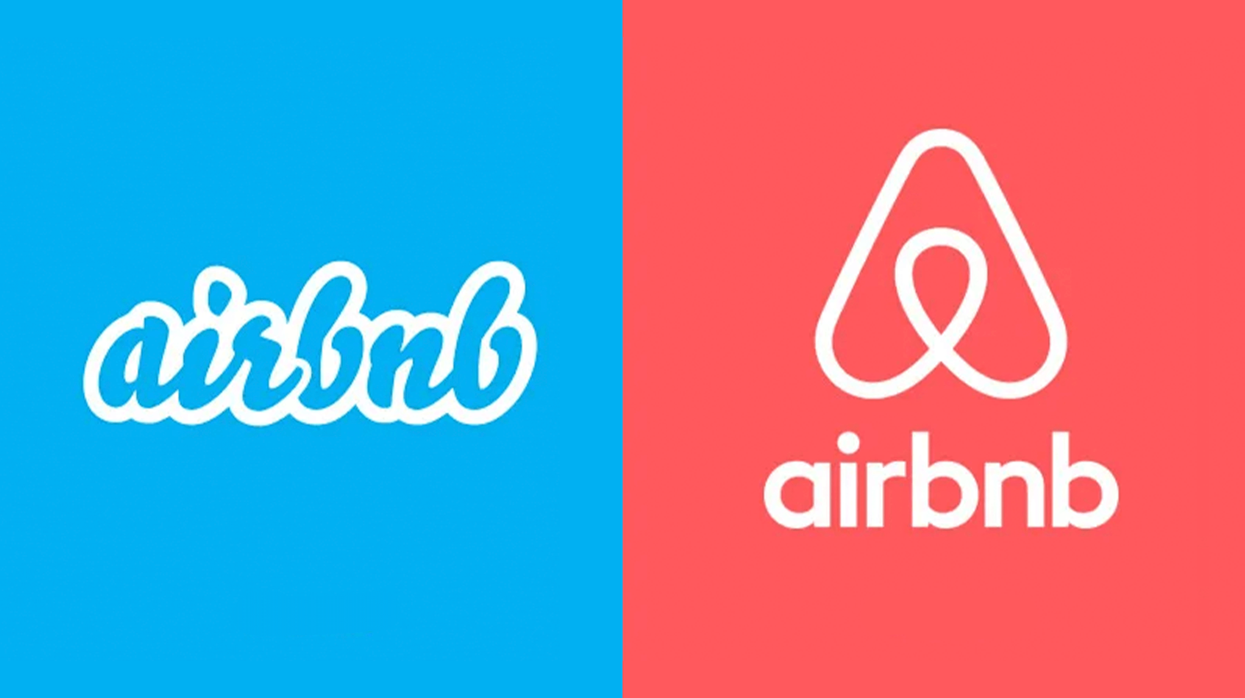
1. Airbnb (2014) — from icon to idea
Before: Airbnb's original logo was a straightforward wordmark. It was functional and clear, but without much personality. It did its job, but it didn't communicate anything distinctive about what Airbnb was or aspired to be.
After: In 2014, Airbnb introduced the Bélo — a custom symbol designed to represent belonging. The mark combines four elements: a head (people), a location pin (place), a heart (love), and the letter A (Airbnb). It's an unusually ambitious concept for a logo, and it landed with both significant admiration and significant mockery.
Why it worked: Despite the initial controversy, the Bélo succeeded because it was built around a clear idea rather than a visual trend. It's simple enough to work at any size, distinctive enough to be recognized without the wordmark, and it communicates the emotional territory Airbnb was staking out — belonging rather than accommodation. That's a meaningful strategic distinction, and the logo carries it.
What this means for your brand: The most durable logos are built around an idea, not just an aesthetic. If you can't articulate what your logo is supposed to communicate beyond "it looks professional," that's a signal worth paying attention to.
2. Instagram (2016) — adapting for a mobile-first world
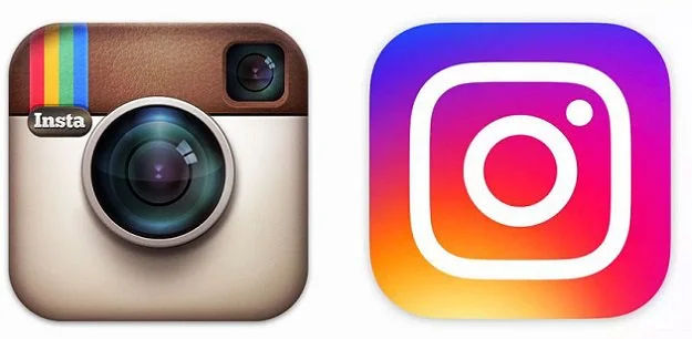
Before: Instagram's original icon was a detailed, skeuomorphic illustration of a Polaroid camera — complete with a rainbow stripe, a lens rendered in careful gradient detail, and a realistic viewfinder. It was charming, nostalgic, and completely unsuited to the direction the platform was heading.
After: The redesign replaced the realistic camera illustration with a flat, simplified camera outline on a gradient background moving from warm yellow through pink to purple. The detail was stripped back to the minimum required for recognition: a lens circle, a viewfinder square, a body.
Why it worked: The redesign was controversial on arrival — the gradient felt jarring to people used to the old icon. But the logic was sound. As Instagram scaled to hundreds of millions of users across increasingly small and varied screen sizes, a simplified icon performed better everywhere: app grids, notification badges, favicons, stickers. The gradient, once everyone adjusted to it, became one of the most recognizable visual identities in social media. Simplification in service of scalability.
What this means for your brand: Pull up your logo at 32 × 32 pixels — the size it appears as a browser favicon. If it's not readable at that size, you have a practical problem that aesthetic preferences can't solve.
3. Slack (2019) — the case for radical simplification
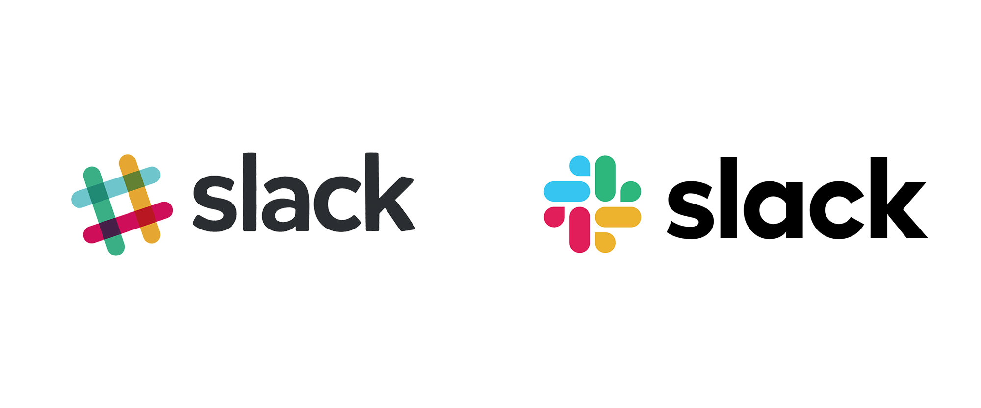
Before: Slack's original logo was built around a hashtag composed of four colorful speech bubbles arranged at 45-degree angles. In principle, a clever concept. In practice, it used eleven different colors and was notoriously difficult to reproduce consistently. On certain backgrounds, the colors clashed. Across different screens and print contexts, the rendering varied.
After: The redesign reduced the color palette from eleven to four — Slack's core brand colors — and rotated the symbol to sit squarely rather than at an angle. The visual complexity was dramatically reduced, the alignment was cleaned up, and the mark became significantly easier to use consistently across contexts.
Why it worked: This is a textbook example of simplification as quality improvement. Nothing was lost in the redesign; the same symbol, the same concept, the same colors — just done with more discipline. The result is a mark that works better in more contexts, reproduces more consistently, and no longer requires a detailed style guide just to use correctly.
What this means for your brand: Complexity in a logo is almost never an asset. Every element that doesn't need to be there is an element that can render poorly, date the design, or create inconsistency. When in doubt, simplify.
4. Dunkin' (2019) — a name change that clarified positioning
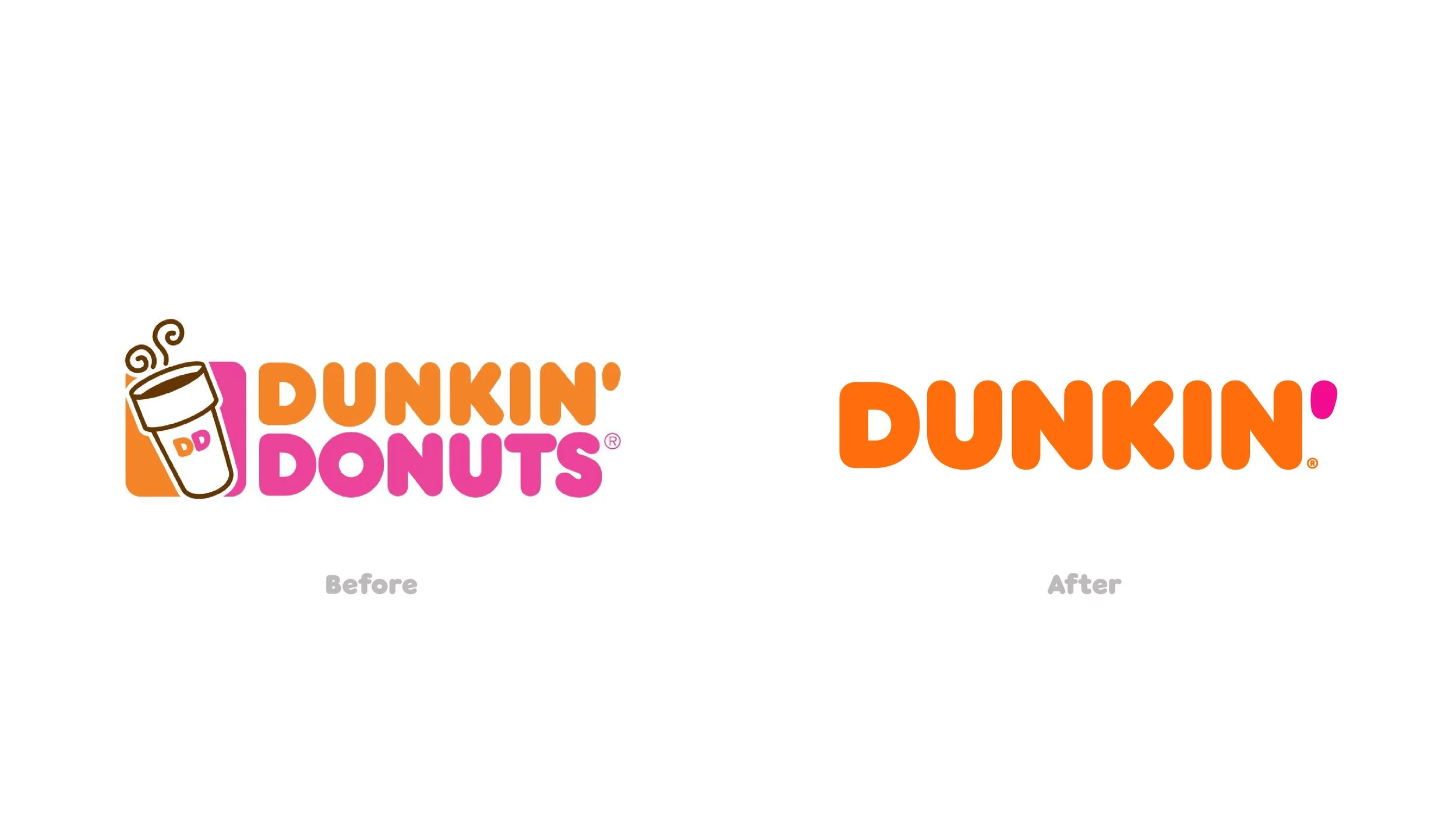
Before: Dunkin' Donuts had operated under that full name for decades. The original branding was anchored to the donut — the product that started the business — with a logotype that leaned into the pink-and-orange color combination that had become genuinely iconic.
After: In 2019, the brand dropped "Donuts" from the name entirely, becoming simply Dunkin'. The visual identity was refreshed — the color palette was retained but modernized, the typography was cleaned up, and the wordmark was simplified. The core visual equity was preserved; the positioning was updated.
Why it worked: By 2019, Dunkin' was generating more revenue from beverages than donuts. The name change reflected reality, freed the brand from being primarily associated with a single product category, and positioned it to compete more directly with coffee-led competitors. The logo change was in service of a genuine strategic evolution, not cosmetic.
What this means for your brand: If your business name or logo describes what you did rather than what you are, that gap will eventually need closing. Better to address it on your terms than wait until it creates confusion.
5. Gap (2010) — a cautionary case study
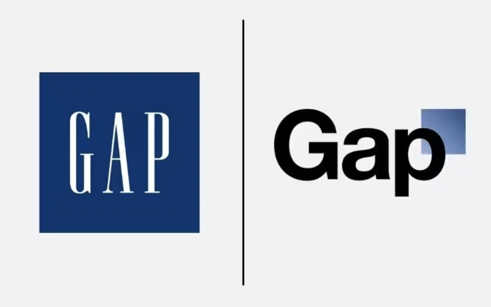
Before: Gap's logo was one of the most recognized in retail: a simple navy blue square with the word "GAP" in white, set in a clean serif typeface. Straightforward, dated by some standards, but universally recognized.
After: In October 2010, Gap quietly updated its website with a new logo — the word "Gap" in a plain Helvetica-style typeface, with a small blue gradient square overlapping the top-right corner of the "p." The update was announced without explanation or campaign support.
Why it failed: The backlash was immediate and overwhelming. Within a week, Gap reversed the change and reinstated the original logo. The design itself wasn't necessarily the problem — the execution was. A change to a widely recognized logo without a strategic narrative, without a rollout, and without any stakeholder engagement is almost certain to fail. Gap's customers had strong emotional attachment to the original mark. That attachment wasn't honored, and the brand paid for it publicly.
What this means for your brand: Logo redesigns require communication, not just execution. Your audience has an emotional relationship with your visual identity. The most successful rebrands bring people along — explaining the change, sharing the thinking, and giving customers time to adjust.
What the best logo redesigns have in common
Looking across these case studies, a few principles hold consistently:
Clarity of purpose. Every successful redesign has a clear answer to "why now, why this?" Rebrands driven by genuine business need hold up. Rebrands driven by trend or boredom don't.
Preserve the equity, update the execution. The most effective logo updates retain the elements that people recognize and trust — the color, the shape, the concept — and improve everything around them. Wholesale changes that throw out established recognition are high-risk.
Simplification almost always improves things. Across every era of logo design, the direction of travel is toward simplicity. Fewer colors, cleaner geometry, less ornamentation. This isn't a trend — it's a practical response to how logos are actually used across an increasing number of contexts.
Design for the smallest size first. If a logo doesn't work as a 32-pixel favicon or a social media avatar, everything else is secondary.
Dave Loden Construction (Jungl Studio, 2026): keeping the equity, fixing the execution
A note on this one: Dave Loden Construction is a client of ours at Jungl Studio. We're including it because it illustrates principles we talk about constantly, and because the before and after speak for themselves.
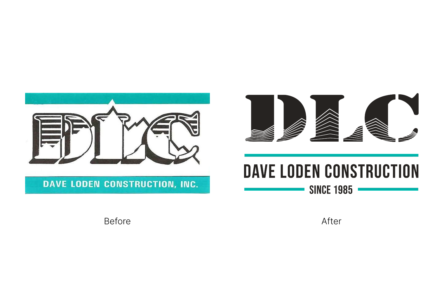
Before: The original DLC logo was built around an ornate blackletter "DLC" monogram with a mountain silhouette woven through the letterforms, bookended by teal banner bars and the full company name reversed out in white. It had personality, and it had history. It also had real problems. The gothic letterforms were dense enough to become illegible at anything smaller than a business card. The mountain motif was there but competing with the type rather than working with it. The overall impression was more 1990s contractor than 40-year-old Colorado institution.
After: The redesign keeps every meaningful element from the original and fixes the execution. The initials are still DLC. The mountain is still there. The teal is still there. What changed is how all of those things relate to each other. The monogram is now set in a bold, structured sans-serif that reads clearly at any size, from a truck door to a favicon. The mountain motif, rather than floating awkwardly behind the letterforms, is cut directly into them as negative space: stacked ridgelines that emerge from within the letters themselves. The teal moves from background fill to a pair of precise horizontal rules that frame the wordmark. "Since 1985" is added below, anchoring forty years of reputation in a single line.
Why it worked: This is a case study in preserving equity while upgrading execution. Nothing was discarded that people recognized or cared about. What changed was the craft: the letterforms, the integration of the symbol, the hierarchy, the system. The new mark works at every size it needs to work at, which the old one did not. And the negative space mountain inside the letterforms is the kind of detail that rewards a closer look without demanding one from a distance.
What this means for your brand: If your logo has a concept worth keeping but execution that isn't holding up, the answer is rarely to start over. More often it's to take what works and do it better. A logo that's been around since 1985 has real recognition value. The goal of a redesign is to honor that while removing the things that are working against you.
FAQ
What is a logo redesign?
A logo redesign is the process of updating or replacing a brand's existing logo — either through a targeted refresh that modernizes specific elements while retaining the overall identity, or a more comprehensive redesign that rethinks the mark from the ground up. Most successful rebrands fall somewhere between these two extremes: evolving rather than replacing.
When should a small business consider a logo redesign?
The clearest signals are: your business has grown into different markets or audiences than the original logo was designed for; the logo doesn't work at small sizes or in digital contexts; the visual style has become dated enough to affect how the brand is perceived; or there's been a significant change to the business — new direction, merger, leadership change — that the current identity no longer reflects.
What's the difference between a logo refresh and a full rebrand?
A logo refresh updates specific elements of the existing mark — the typeface, the color palette, proportions, or level of detail — while keeping the overall concept and recognition intact. A full rebrand reconsiders the identity from its foundations, potentially including the logo, color system, typography, brand voice, and visual language. Most businesses need a refresh far more often than a full rebrand.
How much does a logo redesign cost?
Logo design for small businesses typically ranges from $500 to $3,000+ for professional work, depending on the scope, the number of concepts developed, and whether brand strategy is included alongside the design. The more relevant question is what an outdated or unclear logo is costing you in first impressions and conversion — which usually makes the investment straightforward to justify.
How do I know if my logo redesign was successful?
A successful logo redesign is one that holds up across every context where it appears, communicates what the brand stands for without explanation, is distinguishable from competitors, and remains recognizable to people who knew the previous version. Beyond the subjective, measurable signals include brand recognition in customer research, consistency of logo use across team and partners, and whether the mark requires a lengthy style guide to use correctly.
How long does a logo redesign take?
A focused logo refresh typically takes two to four weeks from brief to final files. A more comprehensive brand identity project — including logo system, color palette, typography, and brand guidelines — runs four to eight weeks for most small business scopes. Rushing the process is the most common reason redesigns don't land well; allow time for iteration, feedback, and refinement.
Can I just update my logo myself?
For minor adjustments — a color shift, a typeface update — a skilled business owner with design tool familiarity can make targeted changes. For anything that affects the underlying concept, proportions, or core visual identity, professional design work is worth it. A logo is the most frequently seen element of your brand; it's one of the poorer places to economize.
Thinking about a logo redesign?
If your current logo isn't doing justice to where your business is today, we're happy to take a look. We offer free brand consultations at Jungl Studio — a genuine conversation about what's working, what isn't, and what the right scope of change looks like for your situation.
Get in touch or see our branding work to get a sense of how we approach identity design.