
Top 10 Small Business Websites in 2025 (And What Makes Them Work)
Your website is your first impression, your sales pitch, and your brand all in one. And for most small businesses, it's either doing that job well, or quietly costing you clients.
We've spent a lot of time studying small business websites. Genuinely a lot. And from that research, we've built a shortlist of the top 10 small business websites that actually stand out — not because these brands had the biggest budgets, but because they made specific, intentional choices that work.
Every site below does at least one thing exceptionally well. Each example comes with a practical takeaway you can apply to your own site, whether you're building from scratch or wondering why your current one isn't converting.
What Makes a Good Small Business Website
Good-looking sites are everywhere. What separates the ones that actually convert comes down to a handful of things done consistently well.
Clarity first. Visitors decide within seconds whether they're in the right place. If your headline doesn't communicate what you do and who it's for, they're already gone.
A distinct visual identity. The best small business sites feel like someone made them. A real point of view, a palette that means something, typography that matches the brand's personality.
A clear path forward. Every page should answer: "what do I do next?" Great sites make that obvious without feeling pushy.
Trust signals that are actually trustworthy. Not stock photos and generic testimonials. Real people, real results, real stories.
Mobile done properly. Not just "responsive," but genuinely considered at every screen size.
Now, the sites that get this right.
The Top 10 Small Business Websites Worth Studying in 2025
1. Gioia New Haven
Gioia is an Italian cafe, bar, gelateria, and market in New Haven, and their website feels exactly like walking in the door. The photography is warm and specific, the copy has real personality ("Gioia brings the joy-ah to the table" is a line we genuinely wish we'd written), and the site is organized clearly across all their distinct offerings without ever feeling cluttered. For a multi-concept food business, that's harder to pull off than it looks.
What this means for your site: If your business has multiple offerings, the navigation and hierarchy of your site is doing real work, or it isn't. Each service or product line should have its own clear home so visitors land exactly where they need to be.

2. HAVN Saunas
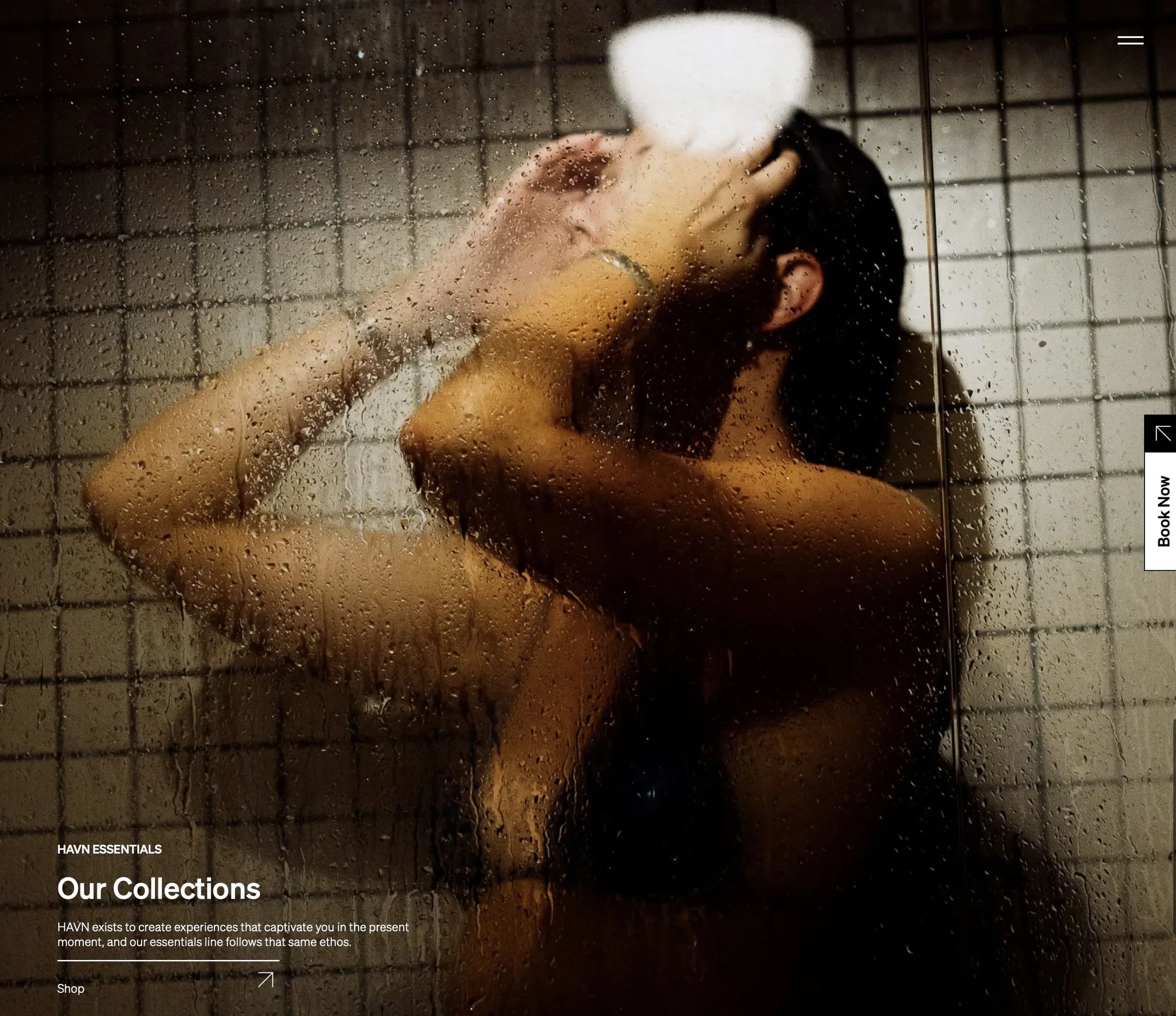
A floating sauna and hydrotherapy experience built on a restored 1943 naval vessel. That sentence alone could carry an entire marketing campaign, and to their credit, the website earns it. The brand leads with mission and feeling before logistics. You understand why HAVN exists before you ever see a booking calendar. It tells the story of a small team building something they genuinely believe in, and it makes you want to be part of it.
What this means for your site: The "what we do" is easy to communicate. The "why we exist" is what creates connection. If your about page or homepage doesn't answer the second question, you're leaving something important out.
3. Sacred Space Miami
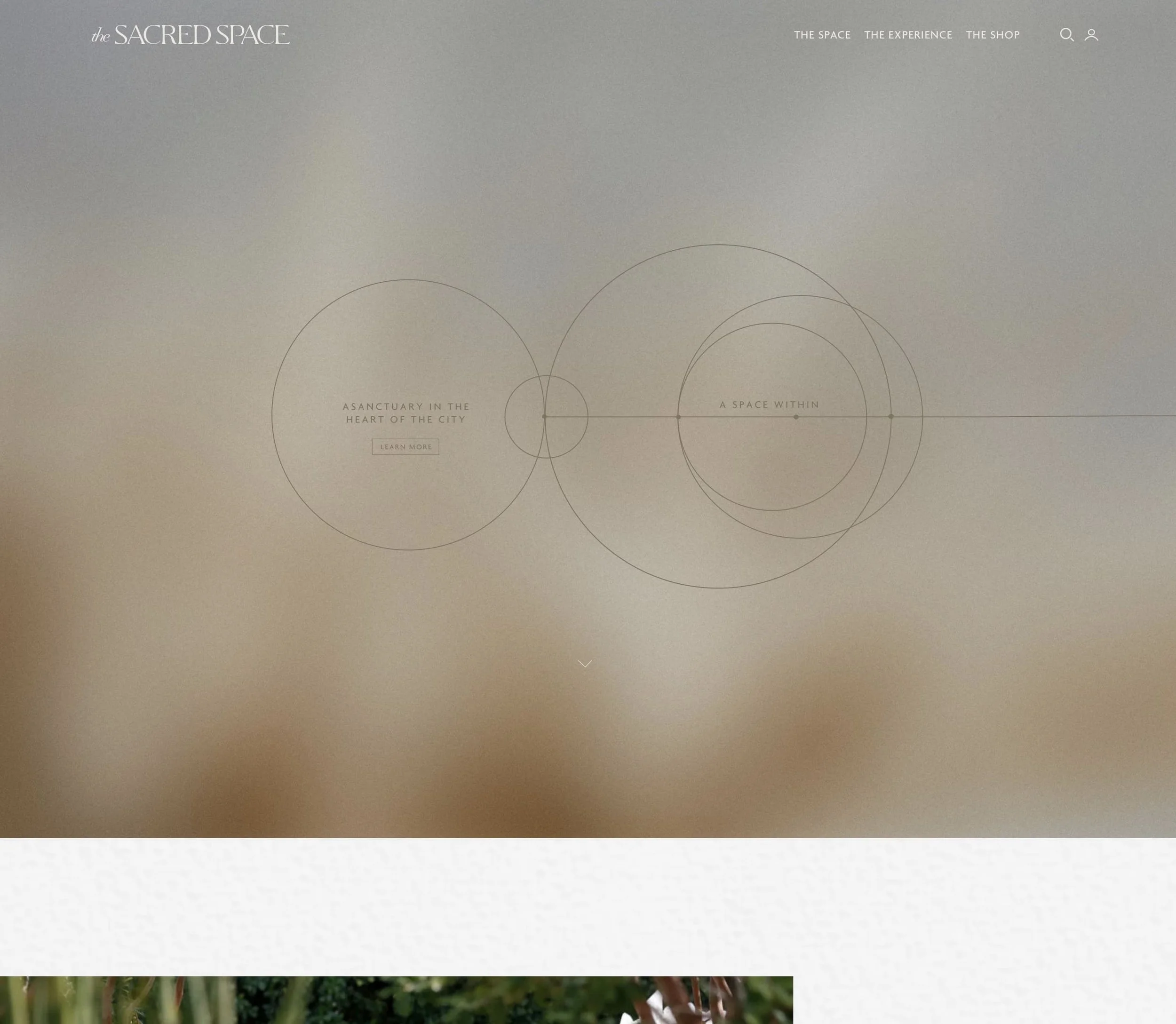
A holistic wellness center, organic farm, and modern farmacy all in one (and yes, "Modern Farmacy" is a great name, we're a little jealous). Founded by Karla Dascal, whose personal story sits at the center of the brand from the first scroll. What the site does brilliantly is carry that mission into every corner of the design. The animation feels intentional rather than decorative, and the visual language holds the whole thing together without tipping into the generic "wellness beige" aesthetic that's everywhere right now.
What this means for your site: Wellness is one of the most visually competitive categories online. If your site looks like everyone else's, neutral tones, stock photography, soft fonts, you're not differentiating. Brand specificity is what makes a site memorable.
4. Alma Studio
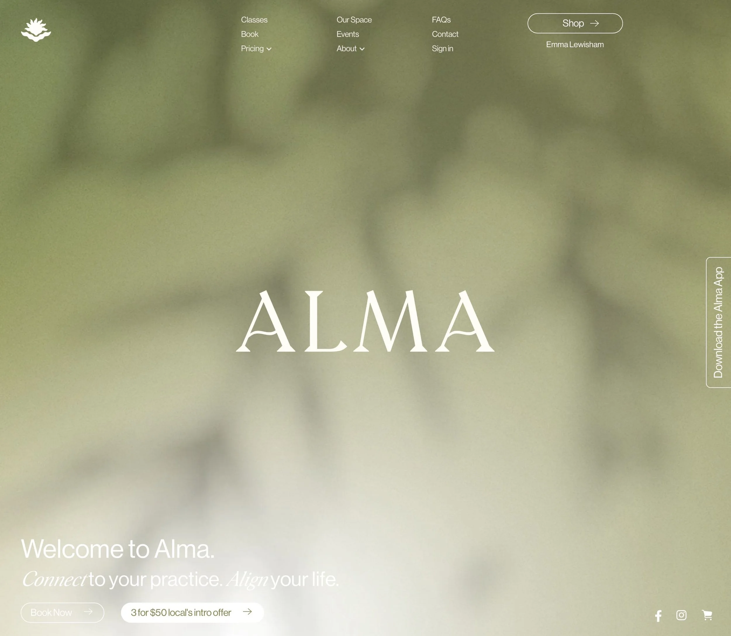
Yoga, Pilates, and meditation in Havelock North, New Zealand. Small, local, and genuinely excellent online. The teacher bios are what we keep coming back to. One instructor trained with the Royal New Zealand Ballet for a decade before a knee injury redirected her toward Pilates. That kind of specificity makes the studio feel real rather than corporate. The color palette and photography are cohesive and calm without being sterile.
What this means for your site: Your "About" page matters more than most business owners realize. Generic team bios are a missed opportunity. Real stories, real credentials, and real faces build the kind of trust that turns a browser into a booking.
5. We The Conscious Studio
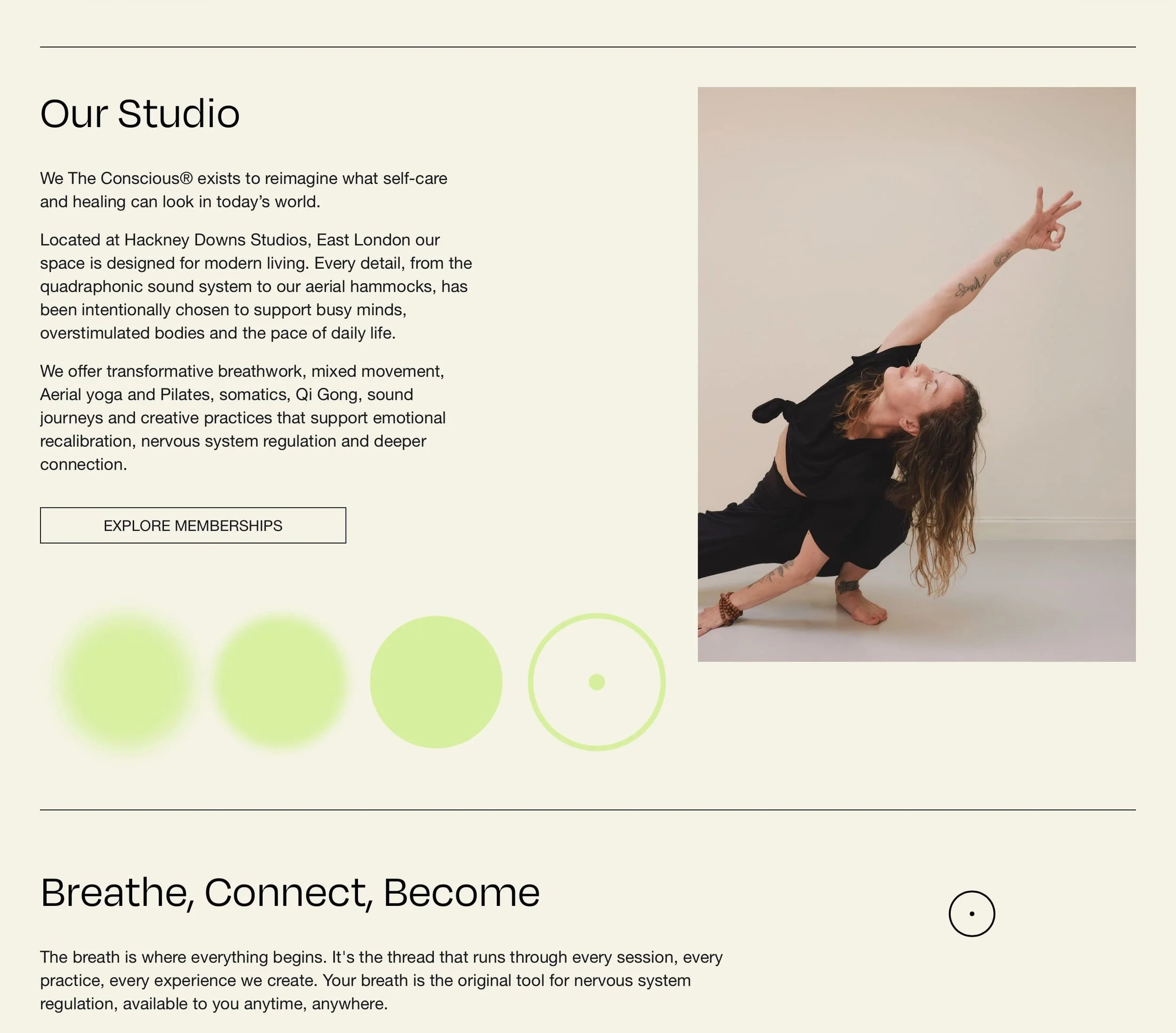
Wellness branding done with a genuine point of view. What stands out here is the styling: considered, confident, and specific. Nothing about it feels assembled from a template or pulled from a mood board with no editorial eye on it. It's proof that a small wellness brand can have visual authority that rivals much larger players, the kind of presence that makes potential clients feel like they're in capable hands before they've read a single word of copy.
What this means for your site: Visual confidence is a signal. When a site's design feels considered, visitors trust the brand behind it more. A polished, specific aesthetic isn't a luxury. It's a conversion tool.
6. Always With Honor
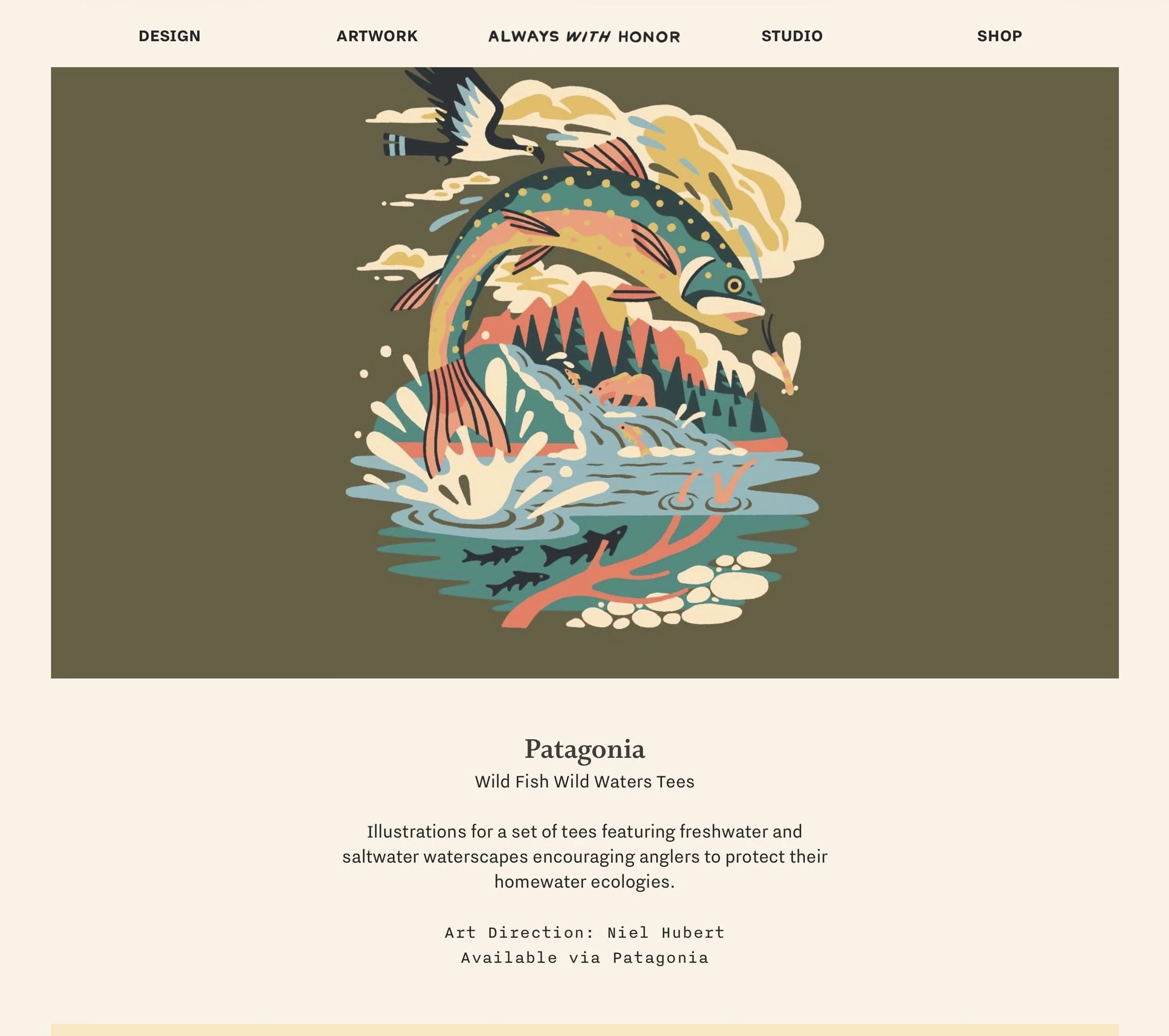
A graphic design and illustration studio based in Portland, Oregon. Clients include Patagonia, Google, Airbnb, and the USPS, and yet the site feels like a small studio, not an agency desperately trying to look big. The portfolio is presented cleanly, the work speaks for itself, and there's a clear point of view running through everything: craft-driven, illustration-forward, story-led. One of the better examples of a creative small business that lets quality do the selling and gets out of its own way.
What this means for your site: If your work is strong, your site's main job is to get out of the way and let it be seen. Over-designed portfolio sites bury the very thing clients came to evaluate. Keep the framework simple. Keep the work large.
7. Open Studios Berlin
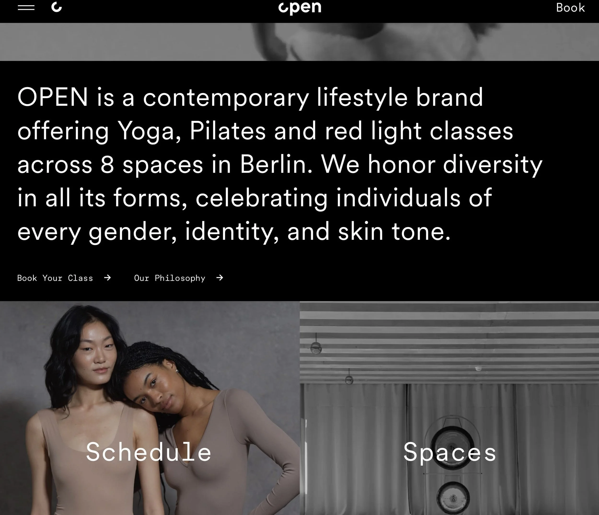
An art studio and creative space in Berlin with branding that feels genuinely intentional and specifically European. What's striking is how distinct the visual identity is. It doesn't look like every other Berlin creative studio, which (having spent time here) is saying something. There's a typographic confidence and a structural logic to the site that feels considered from the ground up, not defaulted into.
What this means for your site: If you're in a creative field, your website is a portfolio piece whether you treat it that way or not. The design choices you make for yourself tell potential clients exactly what they can expect you to make for them.
8. Arc Community
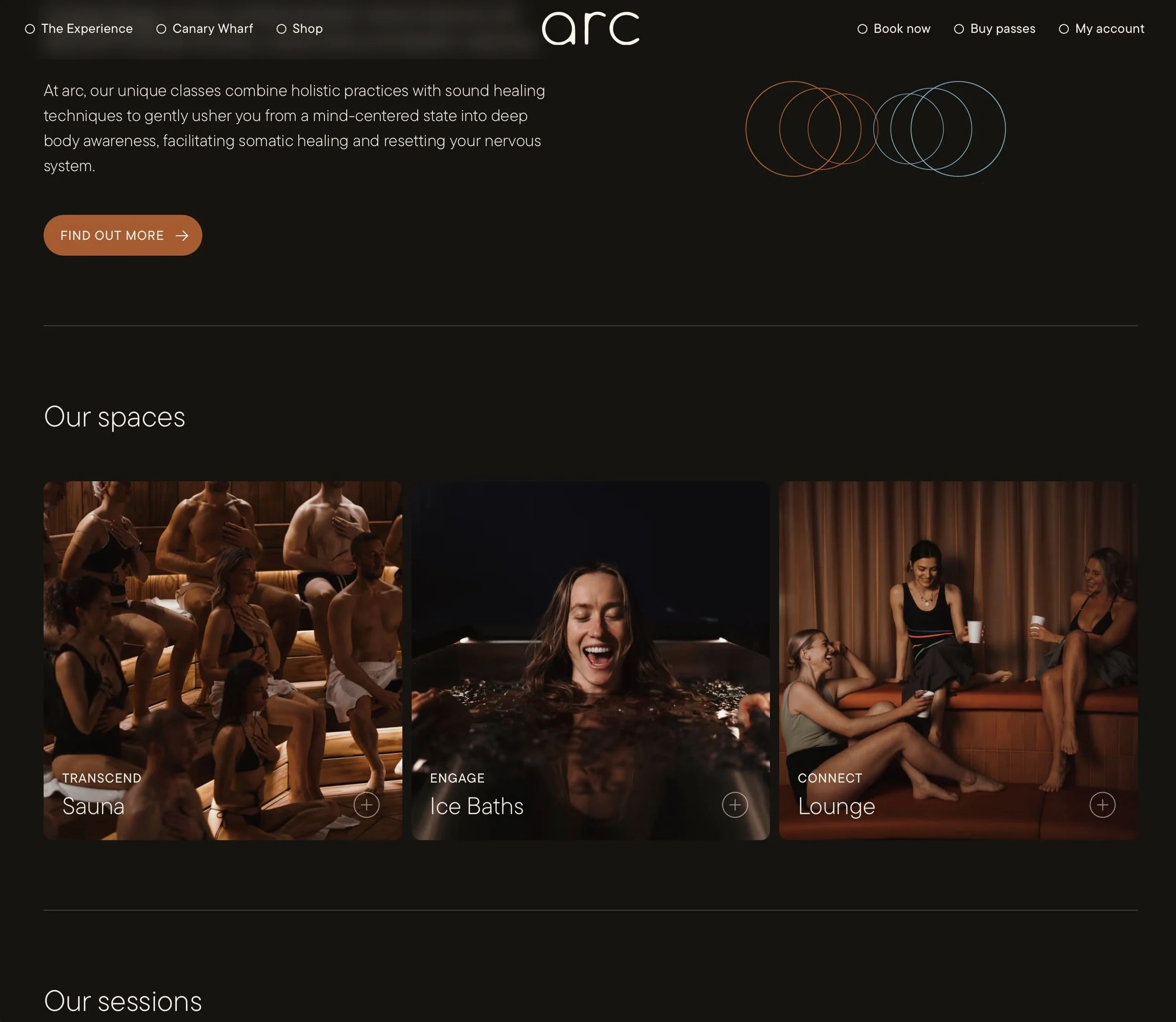
Arc's standout quality is photography, and not just "good" photography. Specific, editorial photography. The images feel art-directed for the brand rather than pulled from a stock library. For a community-based organization, photography is often the most underinvested part of the site. Arc shows exactly what's possible when you get it right, and it's a meaningful difference.
What this means for your site: If your site's imagery doesn't do justice to your actual product or experience, that's likely costing you clients. Great photography doesn't mean expensive. It means intentional. The difference between a site that converts and one that doesn't is often just the quality of the visuals.
9. Timeleft
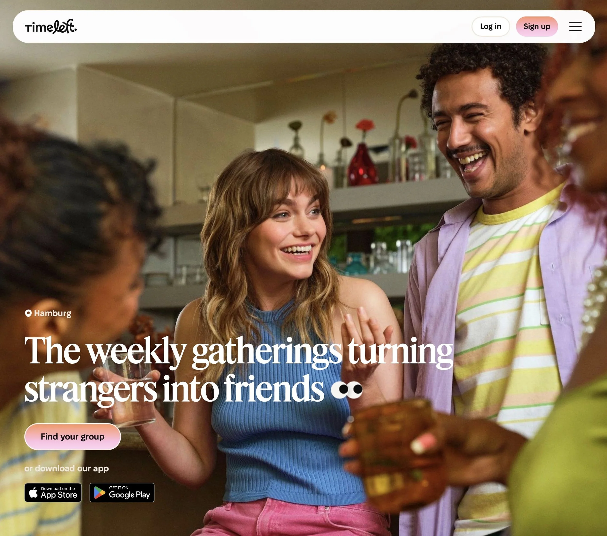
A social experience platform that connects strangers over dinner. (You answer some questions, get matched with people you've never met, and show up to a restaurant. Terrifying and brilliant in equal measure.) What makes the website remarkable is how well the brand and onboarding translate an unusual concept into something you immediately want to try. The signup questions feel like part of the experience itself, not just form fields. It's one of the best examples of a brand using its website UX as an extension of the actual product.
What this means for your site: Your website's job isn't just to explain what you do. It's to create a feeling. The best small business sites make visitors feel something before a single transaction takes place. What does yours make people feel in the first ten seconds?
10. Birk Creative
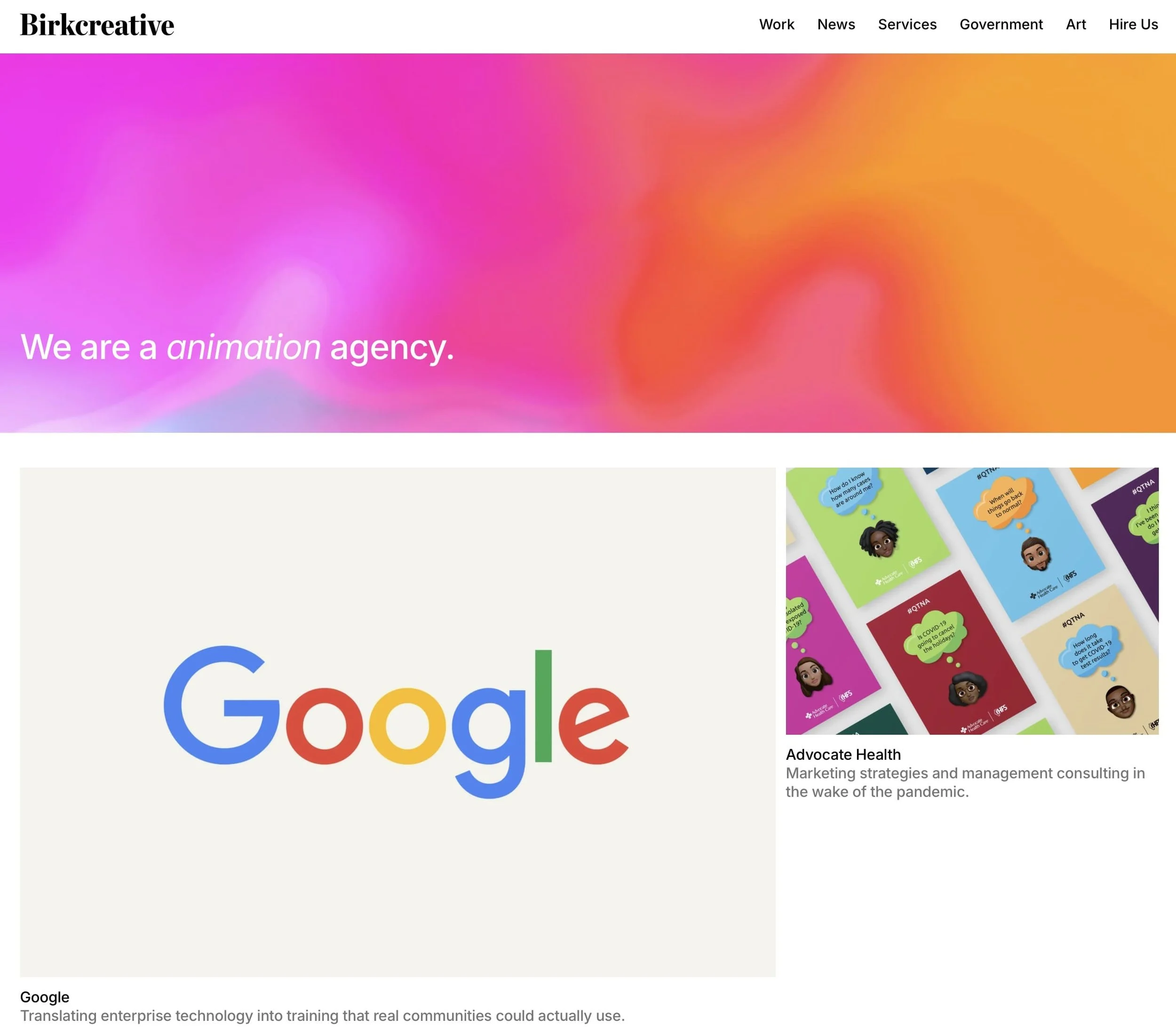
Full disclosure: Birk Creative is a client of ours at Jungl Studio, which is exactly why it made this list. We know what went into it. Birk Creative is a design and branding agency, and the site reflects a brand that's confident in its positioning, clear about who it works with, and built to attract clients who value strategic thinking over flashy aesthetics. The portfolio is clean and curated, the navigation supports how potential clients actually think when evaluating a creative partner, and the whole thing doesn't try to be everything to everyone. That restraint is a choice, and it's the right one.
What this means for your site: The best agency and studio sites don't try to impress everyone. They're specific about who they're for, which paradoxically makes them more appealing to the right clients. Specificity over breadth, every time.
So, How Does Your Site Stack Up?
Before you scroll past, take two minutes with this checklist. Be honest.
Can a first-time visitor understand what you do and who it's for within 5 seconds?
Does your mobile experience feel as considered as your desktop?
Does your site have a clear visual identity: a palette, a type treatment, a consistent aesthetic?
Is there a specific, obvious next step on every page?
Do your photos reflect the real quality of your product or service?
Does your "About" page tell a real story, or read like a boilerplate?
Is there evidence that real clients trust you: testimonials, case studies, press?
More than two "no" answers means your site has room to do more for your business. Not a dig. Just a starting point.
FAQ
What makes a good small business website?
The best small business websites do five things consistently well: they communicate what the business does within the first few seconds, they have a distinct visual identity that feels intentional rather than templated, they guide visitors toward a clear next step on every page, they use real photography and genuine testimonials rather than stock imagery, and they work just as well on mobile as on desktop. Most underperforming small business websites fail on two or three of these — which is exactly what the checklist above is for.
What should a small business website include?
At minimum: a clear homepage headline that explains what you do and who it's for, an about page with real people and a real story, a services or product page with specific details and pricing context, social proof in the form of testimonials or case studies, and a contact page or booking option that's easy to find. Beyond the basics, a blog and an FAQ page both help with organic search visibility over time.
How many pages does a small business website need?
Most small businesses do well with five to seven core pages: Home, About, Services (or Products), Portfolio or Work, FAQ, Contact, and optionally a Blog. More pages aren't automatically better — a tightly focused five-page site almost always outperforms a sprawling twenty-page one where content is thin and navigation is confusing.
What is the best website builder for small businesses?
For most small businesses, Squarespace hits the right balance of design quality, ease of use, and built-in SEO tools. Shopify is the better choice for e-commerce-first businesses. WordPress offers the most flexibility but requires more technical management. The right platform depends on your business model, how often you'll update the site yourself, and whether you're selling products or services.
How much does a small business website cost?
A professionally designed small business website typically ranges from $1,500 to $5,000+ depending on scope, the number of pages, and whether custom development is involved. DIY builders like Squarespace start at around $16–$23/month for the platform alone, with design and content time on top. The more relevant question is what a poorly performing website is costing you in missed leads — which tends to make the investment easier to justify.
Do small businesses really need a website?
Yes — and increasingly, the quality of that website matters as much as having one at all. A basic placeholder site can actually do more harm than good if it creates a poor first impression. Customers research businesses online before making contact, and a site that looks dated, loads slowly, or doesn't clearly explain what you offer will lose those potential clients to competitors who've invested in theirs.
Ready to See What's Actually Holding Your Site Back?
We do free website reviews at Jungl Studio. No pitch, just an honest 10-minute look at what's working and what isn't. If you're a small business owner who suspects your site isn't converting the way it should, book a free review here or see our web design work.
Most of the businesses above didn't start with perfect websites. They just worked with people who understood what good looks like and had the design chops to get them there.
This Is Part of a Series
This is the first post in our Web Design Inspo series, a running look at the best websites in specific industries and what small businesses can learn from each.
Coming up:
The Best Wellness & Spa Websites (And Why They Convert)
Top Restaurant & Hospitality Websites Done Right
The Best Creative Studio Websites for Winning Clients
Top Local Service Business Websites Worth Studying
Check back or subscribe. We add a new category every few weeks.
Want us to feature your site in an upcoming edition? Get in touch here.