
Web Design Trends for 2025: What's Actually Worth Implementing
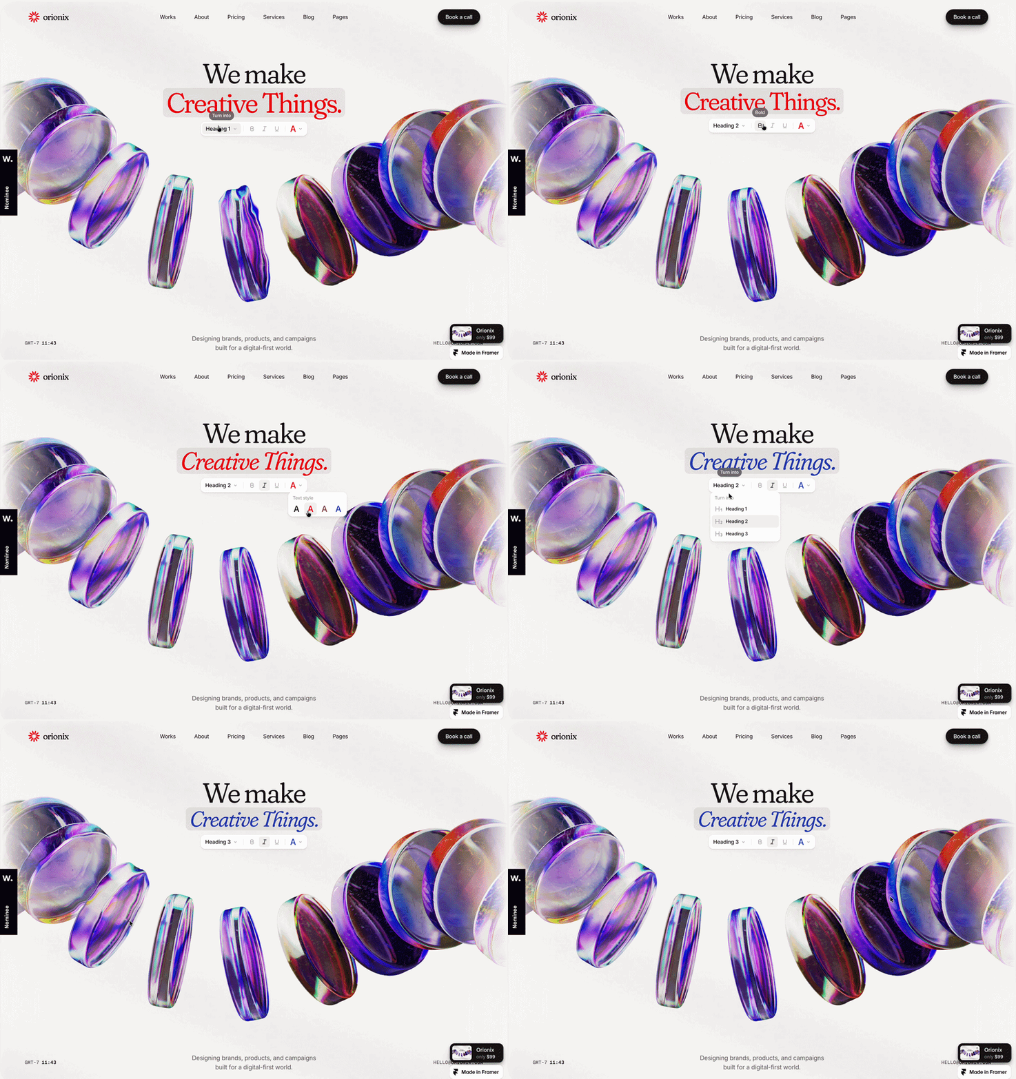
Every year, the web design conversation produces an overwhelming list of trends. Many of them are either already everywhere, only relevant to enterprise brands with large development teams, or simply not going to last. This post cuts through that.
What follows are the web design trends that are genuinely shaping how effective websites look and behave in 2026, chosen for their impact on small business sites specifically. For each one, there's context on why it matters and a practical takeaway you can act on, whether you're refreshing an existing site or building from scratch.
What to actually do with web design trends:
Before the list: a word on how to use this.
Web design trends are signals, not mandates. The ones worth paying attention to are the ones that make your site easier to use, more memorable, or better at converting visitors into clients. The ones worth ignoring are the ones that exist purely for aesthetic novelty and add friction for the people you're trying to reach.
The question to ask about any trend isn't "is this popular?" It's: "does this serve my visitors?"Brutalism Gets Playful
10 web design trends for 2026 worth paying attention to
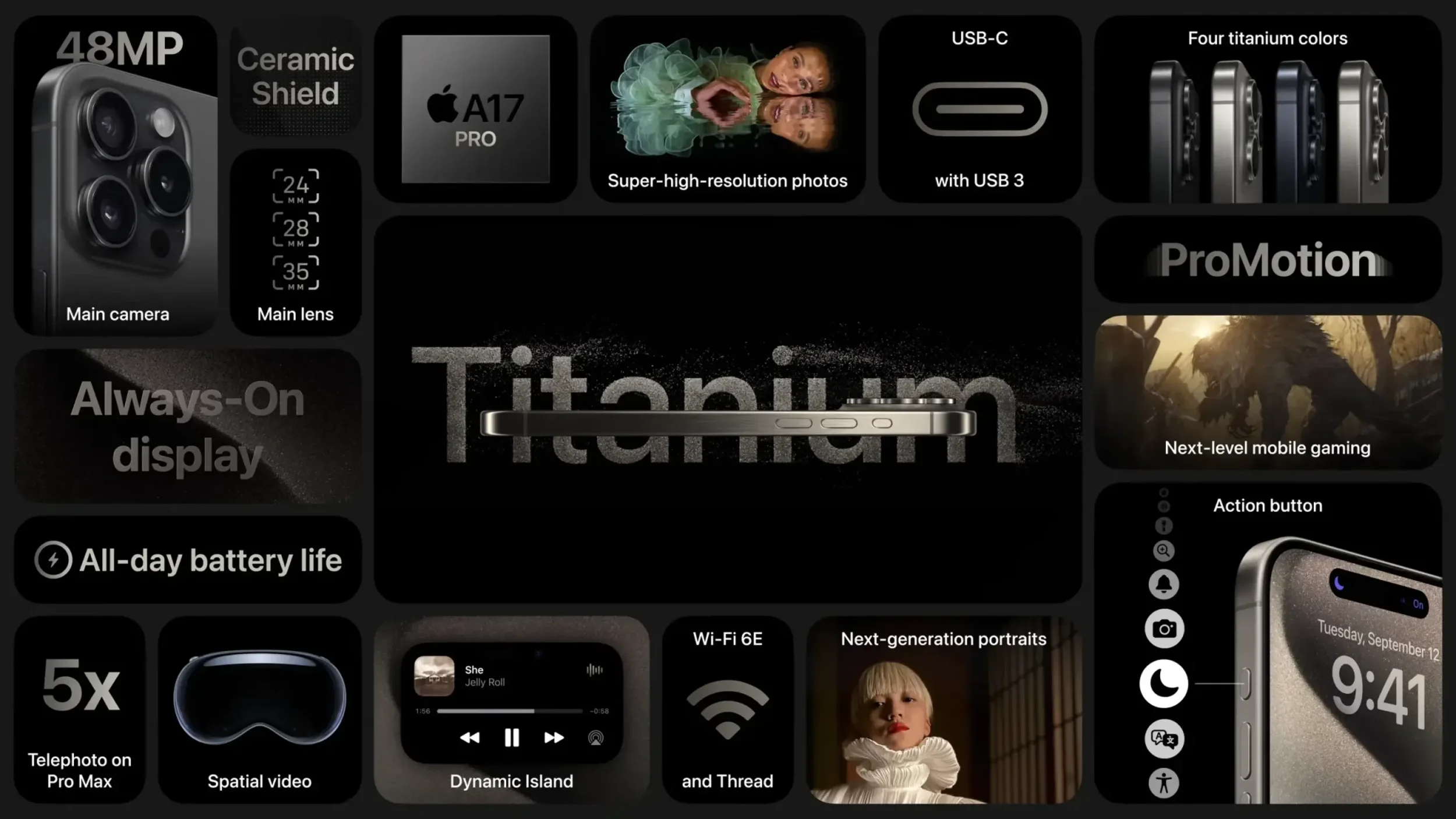
Apple’s bento grid overview layout
1. Bento grid layouts
If you've watched an Apple product launch in the last few years, you've seen bento grids. Named after the segmented Japanese lunch box, bento layouts organize content into modular, asymmetric grid panels that each highlight a different feature, product, or piece of information. It's a clean, structured way to show a lot without overwhelming the visitor.
For small businesses, bento grids work particularly well on service pages and homepages where you need to communicate multiple offerings quickly. Rather than stacking long blocks of text, the layout lets each value proposition breathe in its own visual container.
The practical version of this doesn't require a custom developer. Squarespace's grid-based layouts and section editors can get you most of the way there with careful content architecture.
What this means for your site: If your homepage is a single scrolling column of text blocks and images, a more modular layout could make the same content significantly easier to scan and understand.
2. Scroll-driven animation
Scroll-triggered animation has matured. Where earlier versions of this trend often felt like a gimmick, with elements flying in from every direction as you scroll, the 2026 version is more restrained and purposeful. Content that reveals gradually as the visitor reads, headlines that animate in on scroll, and parallax effects tied to story progression are all now part of this.
The key distinction is whether animation is doing work or just performing. Scroll-driven animation works when it guides attention, creates a sense of pacing, or makes a concept easier to understand. It fails when it delays access to information or draws attention away from the content itself.
For small business sites, one or two well-placed scroll animations, such as a headline that fades in or a stat that counts up, is often more effective than a fully animated experience.
What this means for your site: Before adding any animation, identify what it's supposed to help the visitor do. If there's no clear answer, leave it out.
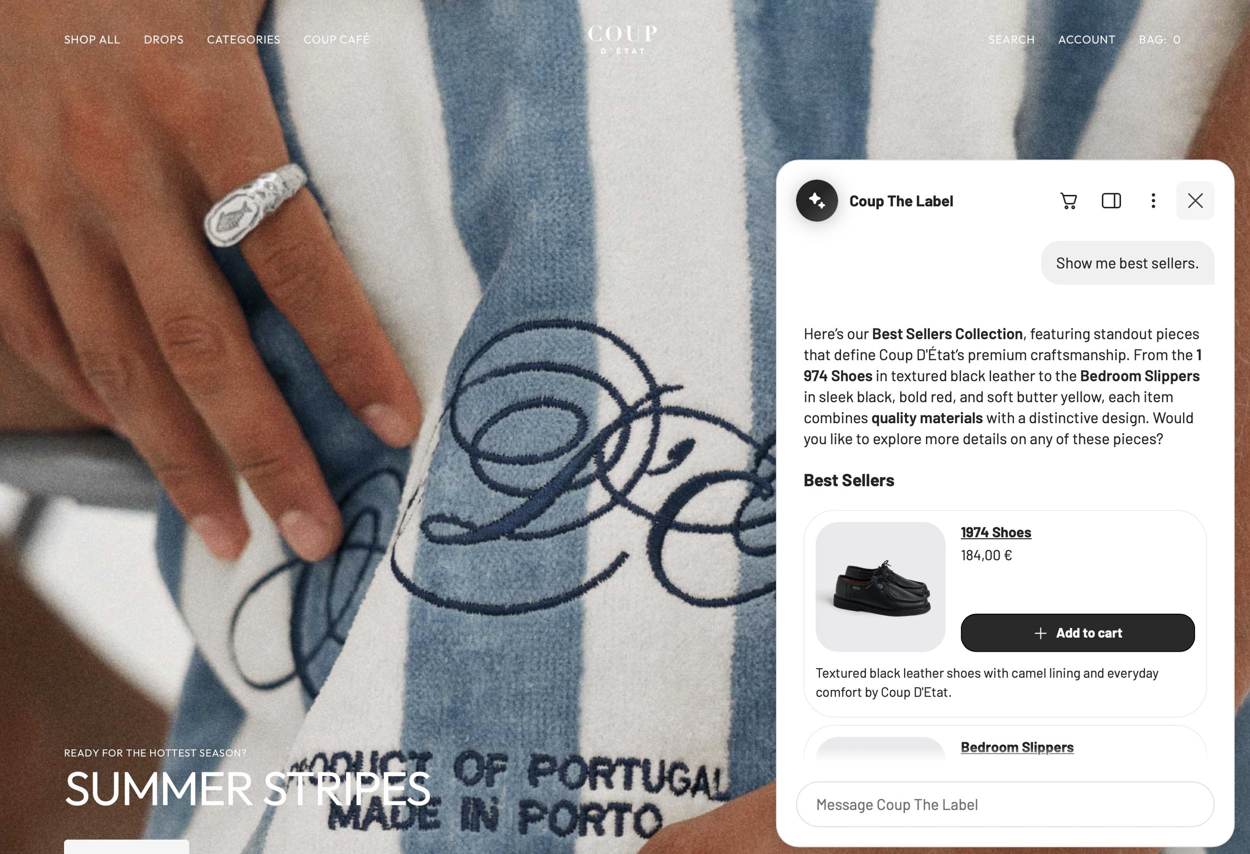
Coup the Label uses Google’s AI Shopping tool to engage customers and drive sales
3. AI-assisted design and personalization
AI is reshaping how websites are built and how they behave. On the build side, AI tools are accelerating copywriting, image generation, and layout iteration. On the experience side, smarter sites are beginning to adapt content, recommendations, and even visual emphasis based on user behavior.
For most small business websites, the immediate practical application isn't personalization. It's using AI tools to improve the quality and consistency of your content and imagery. AI-generated photography alternatives, smarter copy testing, and automated accessibility improvements are all within reach without a technical team.
The more sophisticated personalization applications, including dynamic content swaps based on user location, behavior, or referral source, are increasingly available in platforms like Webflow and through third-party integrations, and worth watching as costs continue to drop.
What this means for your site: You don't need to build a personalized experience today. But using AI tools to raise the baseline quality of your copy, imagery, and SEO will compound over time.
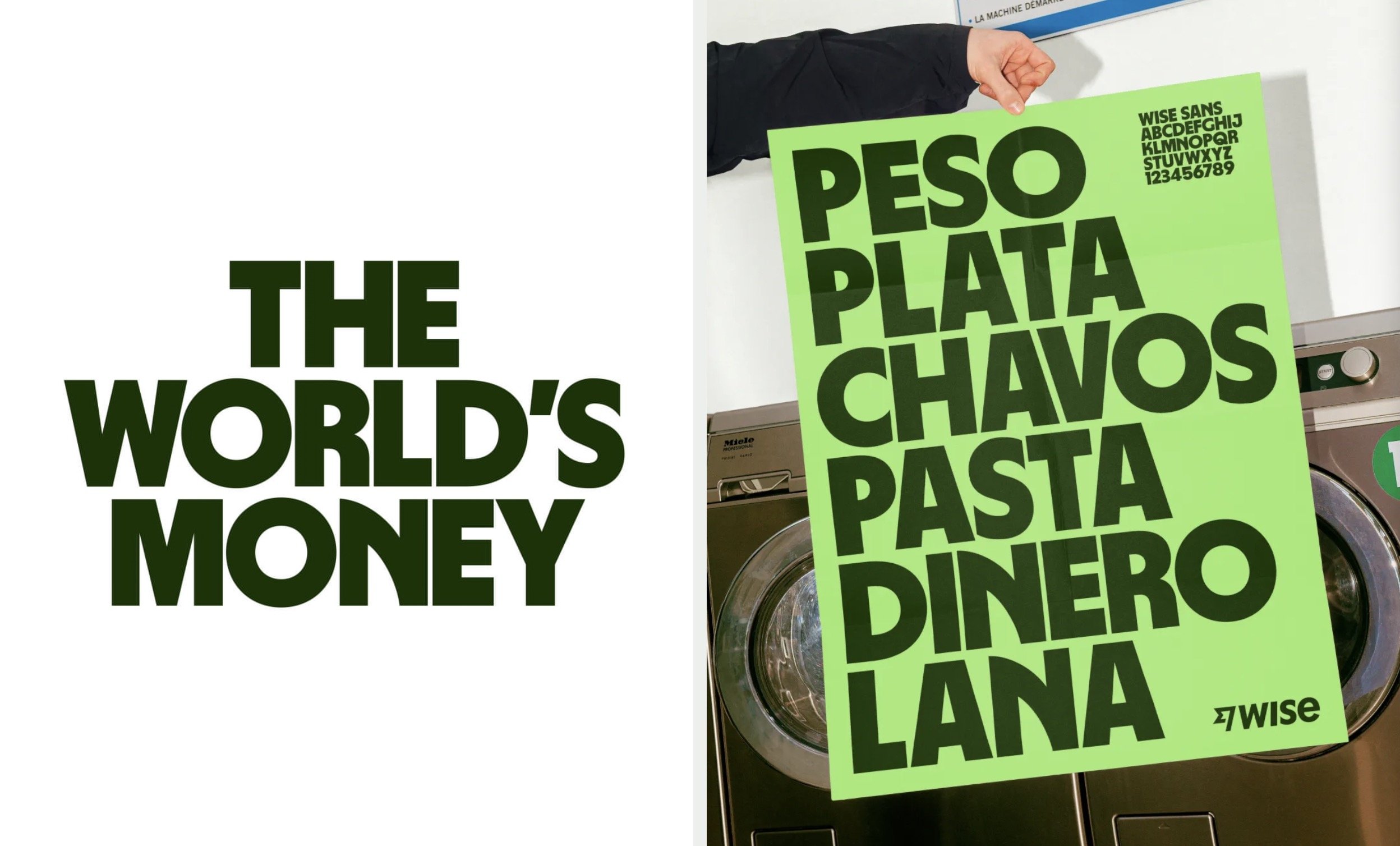
Bold typography by Wise, done by raggededge branding
4. Bold, editorial typography
Typography is having a moment. Large-scale display type, expressive font pairings, and headlines treated as visual elements rather than just text containers are a defining characteristic of the strongest-performing small business websites right now. The shift is away from safe, invisible typography and toward type that communicates brand personality before a single word is processed.
This trend is particularly accessible because it doesn't require custom illustration or expensive photography to execute. A strong type choice, well-set at scale, can transform a page that felt generic into one that feels intentional and memorable.
The constraint is mobile. Type that looks commanding on a desktop can become illegible or overwhelming on a small screen if it hasn't been considered across breakpoints.
What this means for your site: Review your homepage headline. Is the type size, weight, and font doing meaningful work, or is it just sitting there? A type treatment that takes a point of view is one of the highest-leverage, lowest-cost improvements most small business sites can make.
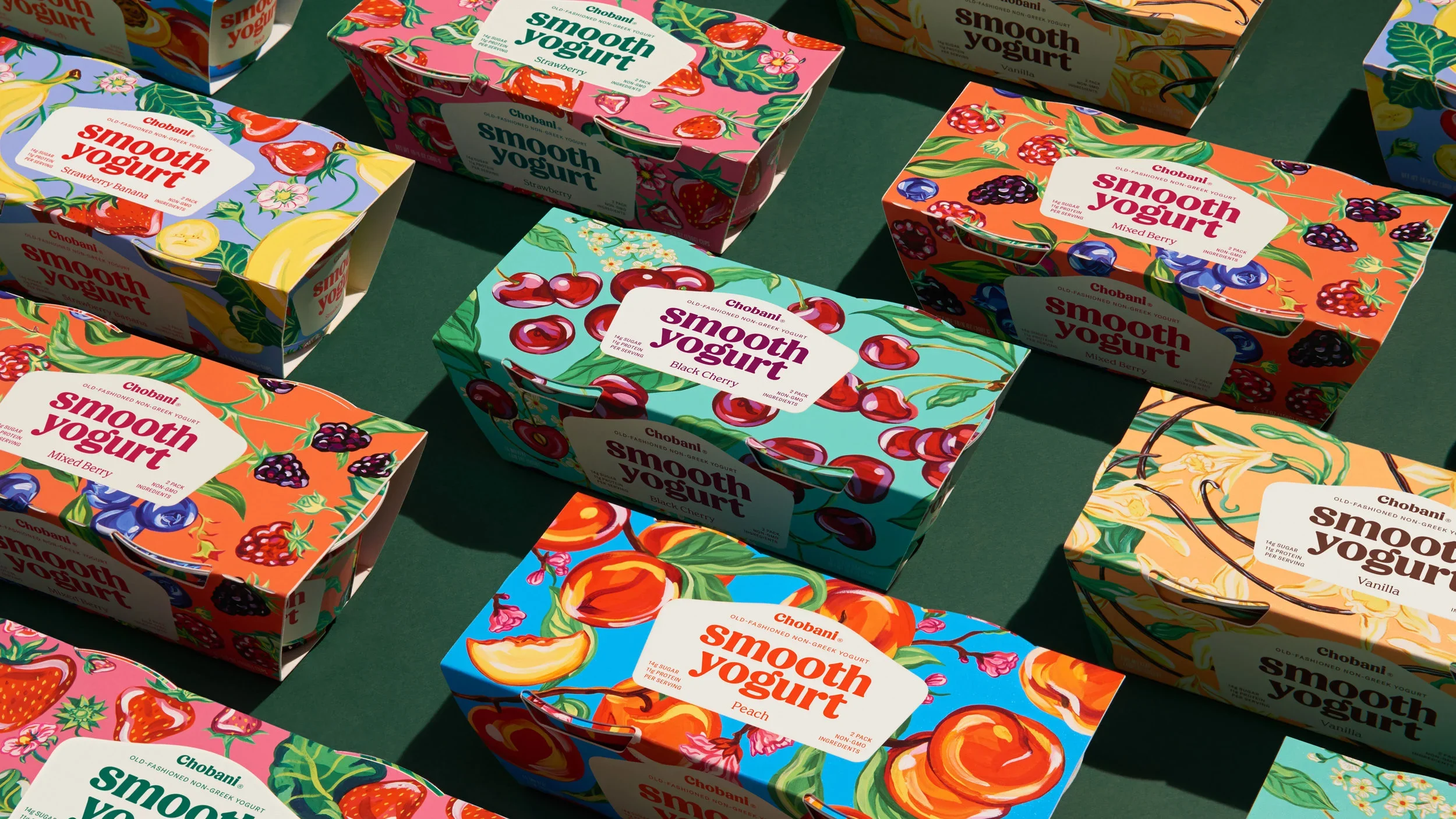
Chobani packaging as part of their rebranding
5. Custom illustration and brand-specific graphics
Stock photography is not neutral. Generic images of laptops, handshakes, and smiling professionals don't just fail to differentiate your brand. They actively signal that you haven't invested in how you look. Custom illustration, brand-specific iconography, and abstract graphics that reflect your visual identity are increasingly what separates sites that feel real from ones that feel assembled.
This doesn't mean every small business needs a full illustration suite. A consistent set of icons, a hand-drawn element or two used deliberately, or photography styled specifically for your brand achieves the same effect. The goal is specificity: visuals that could only belong to your brand.
Beyond aesthetics, custom graphics typically result in smaller file sizes than high-resolution photography, which directly improves page load speed.
What this means for your site: Audit your current imagery. Could it appear on any competitor's website? If yes, it's not working hard enough for your brand.
Google PageSpeed insights are great to test your website’s speed on multiple devices at once
6. Sustainable and performance-first web design
Fast websites aren't just a technical preference. They're a business advantage. Google uses page speed as a ranking signal, visitors abandon slow-loading pages within seconds, and bloated websites cost more to run and maintain. In 2026, the overlap between sustainable web design (leaner code, compressed assets, greener hosting) and high-performance web design (fast loads, optimized delivery) is nearly total.
This means compressing images properly before uploading, minimizing unnecessary scripts and plugins, choosing hosting that's optimized for speed, and being intentional about every element that adds weight to a page.
On Squarespace, this often means being selective about third-party integrations, keeping image sizes reasonable, and avoiding video content that plays automatically on page load.
What this means for your site: Run your site through Google's PageSpeed Insights. The results will tell you exactly where the biggest performance gaps are and give you a priority list for addressing them.
7. Minimalism with a point of view
A reaction to the maximalist, feature-dense sites of the last decade, considered minimalism is one of the strongest aesthetic directions in 2026 web design. But this isn't minimalism as a default. It's minimalism as a deliberate choice. White space that's proportioned, not just empty. Color used sparingly but precisely. Layouts that feel generous rather than sparse.
The distinction matters because "minimal" is often used as an excuse for under-designed sites. True considered minimalism requires more thought, not less. Every element that stays needs to justify its presence. Every color choice needs to be intentional. The result, when done well, communicates confidence and quality before the visitor has read a single word.
What this means for your site: Look at your current homepage with fresh eyes. What would the page communicate if you removed half the elements? If the answer is roughly the same thing, you have too many elements.
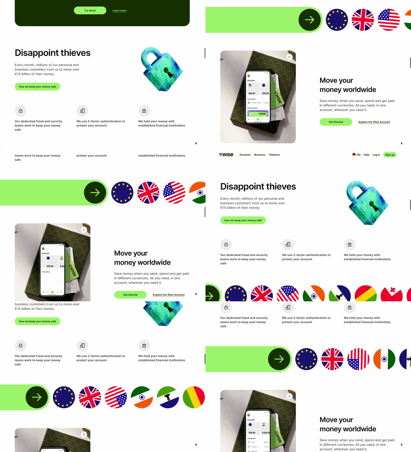
Wise uses movement to guide the user through their page
8. Accessibility as a design standard
Web accessibility, designing sites that work for people with visual, motor, cognitive, or hearing differences, is shifting from a nice-to-have to an expectation. Partly regulatory (particularly in the EU, where accessibility requirements are tightening), partly reputational, and partly practical: accessible design almost always improves usability for everyone.
The basics aren't complicated. Sufficient color contrast, readable font sizes, descriptive image alt text, keyboard-navigable interfaces, and captions on video content cover most of what's needed. Most small business sites have gaps in at least two or three of these areas.
For Squarespace sites specifically, the platform has improved its accessibility infrastructure, but common mistakes remain. Low-contrast color combinations, missing alt text on uploaded images, and navigation menus that don't work on keyboard are all easily addressed.
What this means for your site: Run your site through WebAIM's contrast checker and Google's Lighthouse accessibility audit. Both are free, take five minutes, and will surface the most important issues.
9. Purposeful micro-interactions
Micro-interactions are the small, functional animations that respond to user actions: a button that subtly shifts when hovered, a form field that confirms successful input, a navigation item that underlines on focus. Done well, they make an interface feel responsive and alive. Done poorly, they add visual noise and slow the site down.
The 2026 standard for this trend is restrained and functional. Every micro-interaction should serve a purpose: confirming an action, directing attention, or providing feedback. Decorative animations that don't help the visitor understand what's happening are increasingly recognized as a usability problem rather than a feature.
What this means for your site: If you're going to add micro-interactions, start with hover states on buttons and links. These are the most universally useful and the easiest to implement without affecting performance.
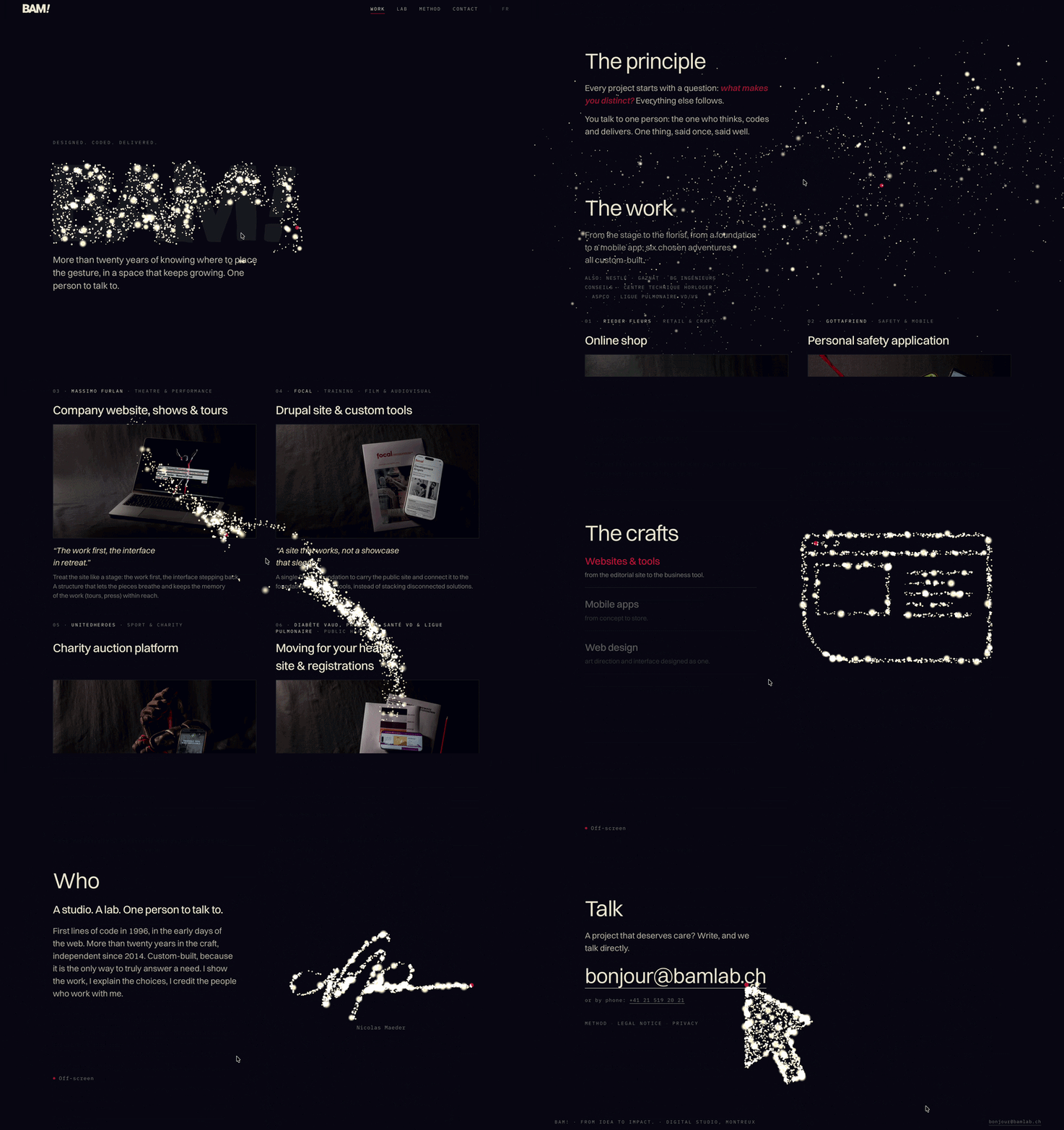
Clever micro interactions guiding the user
10. Voice search and conversational content structure
Voice search has changed how people find things online. When someone speaks a query rather than typing it, the phrasing is different: longer, more conversational, more question-based. "Best web designer in Hamburg" becomes "who is the best web designer in Hamburg for a small business." Content structured around natural questions, which is what FAQ sections do, captures a disproportionate share of voice search results.
For small businesses, this reinforces two practical things. First, writing content in a natural, conversational register, the way people actually speak. Second, building explicit FAQ sections on key pages so that Google has clearly structured question-and-answer content to surface.
What this means for your site: Add FAQ sections to your homepage, service pages, and key blog posts. Write the questions exactly the way someone would ask them out loud.
A note on what doesn't change
For all the trends worth tracking, the fundamentals of good web design don't shift year to year. Fast load times, clear navigation, a mobile experience that's genuinely considered (not just "responsive"), and content that communicates what you do and who it's for within the first few seconds: these are the baseline. No trend compensates for a site that fails here.
If your site has fundamental usability or performance problems, fix those before worrying about bento grids or scroll animations.
FAQ
What are the biggest web design trends in 2025?
The most impactful trends in 2025 are bento grid layouts, scroll-driven animation, bold editorial typography, and performance-first design. For small businesses specifically, the trends with the most practical upside are typography, custom illustration over stock photography, and accessibility improvements — each of which can be implemented without a large development budget.
How often should I update my website design?
A full redesign every two to three years is typical for most small businesses. In between, targeted refreshes — updating imagery, refining typography, improving page speed, adding new content — keep the site current without the cost and disruption of a complete rebuild. If your site is more than four years old and hasn't been touched, it's worth a proper audit before anything else.
What makes a website look modern in 2025?
Modern-looking sites in 2025 share a few characteristics: purposeful use of white space, strong and specific typography, imagery that's clearly brand-specific rather than generic, smooth but restrained animation, and a mobile experience that feels as considered as the desktop. The common thread is intention — every element is there for a reason.
Do web design trends matter for small businesses?
Selectively, yes. Small businesses don't need to chase every trend — the ones worth paying attention to are the ones that improve clarity, credibility, or conversion. A trend that makes your site harder to navigate or slower to load is actively harmful, regardless of how popular it is. Use trends as inspiration, not instruction.
What web design trends should I avoid?
In 2025, the trends with the worst risk-to-reward ratio for small businesses are heavy 3D elements (performance cost rarely justified by the result), aggressive parallax on mobile (almost always a bad user experience), and auto-playing video in hero sections (slow, distracting, and frequently muted by default). For most small businesses, clean and fast beats complex and impressive.
What is the best website platform for small businesses in 2025?
Squarespace remains one of the strongest options for small businesses that want design quality, ease of use, and built-in SEO tools without requiring a developer for ongoing maintenance. Shopify is the right choice for e-commerce-first businesses. WordPress offers the most flexibility but requires more technical management. The right platform depends on your business model and how comfortable you are with ongoing site management.
How much does a website redesign cost for a small business?
A professionally designed small business website typically starts around $1,500–$2,500 for a straightforward build and can go higher depending on the number of pages, custom functionality, and whether brand strategy or copywriting is included. The more useful framing is what a high-performing site is worth to your business in leads and conversions — which usually makes the investment easy to justify.
Ready to see how your site stacks up against these trends?
We offer free website reviews at Jungl Studio — a genuine 10-minute audit of what's working, what isn't, and where the biggest opportunities are. No pitch. Just an honest look.
Book a free website review or see our web design work to get a sense of what we build.