Why “Above the Fold” Content Is Still King in Web Design
The content “above the fold” on a website is crucial. It’s the first thing visitors see without scrolling, shaping their initial impression and engagement. This prime screen real estate must deliver clear, immediate value and guide users toward action.
In the fast-moving world of web design, trends come and go—but some principles stay timeless. One of the most important? Above the fold content.
At Jungl Studio, we design websites with strategy baked in, not just aesthetics. Understanding what “above the fold” means and why it matters can be the difference between a website that converts and one that gets scrolled past.
What Does “Above the Fold” Mean?
The term “above the fold” comes from print newspapers. The most eye-catching stories and images appeared above the fold of the paper—where passersby could see them immediately. In web design, it refers to the content a user sees without scrolling when they first land on your site.
While the exact fold varies by device (desktop, tablet, mobile), the principle is the same: the first impression of your site should instantly communicate who you are, what you do, and why a visitor should stay.
Why Above the Fold Matters
First Impressions Happen Fast
Studies show users form an opinion about your website in 0.05 seconds. That’s faster than a blink. If your above-the-fold content doesn’t engage, users may bounce before exploring further.
Better SEO Performance
Google prioritizes user experience. A strong above-the-fold layout—featuring clear headings, relevant keywords, and engaging media—can improve dwell time (how long someone stays on your page). This signals to search engines that your content is valuable, helping boost rankings.
Guides the User Journey
Think of above-the-fold as the welcome mat. A clean headline, compelling visuals, and a clear call-to-action help visitors understand exactly what to do next—whether that’s learning more, making a purchase, or booking a service.
Mobile Considerations
Mobile traffic now makes up over 50% of web usage worldwide, so designing for small screens is non-negotiable. On mobile, “the fold” is much higher—meaning you have even less real estate to make an impact.
Key considerations:
Prioritize clarity: One strong headline > cluttered visuals.
Load speed matters: Compressed images and optimized layouts keep mobile users from bouncing.
Test on multiple devices: A fold on an iPhone is different from a fold on a Galaxy tablet. Always preview across screen sizes.
How Do You Measure “The Fold”?
There isn’t a universal pixel height that defines the fold—because every screen is different. Instead, designers and marketers use tools like:
Browser preview tools (Chrome DevTools, Safari Responsive Design Mode).
Heatmaps (e.g., Hotjar, Crazy Egg) to see where users scroll and drop off.
Analytics (Google Analytics engagement metrics) to measure bounce rates and time on page.
The “fold” is dynamic, but the principle remains: put your most important content first.
Best Practices for Above the Fold
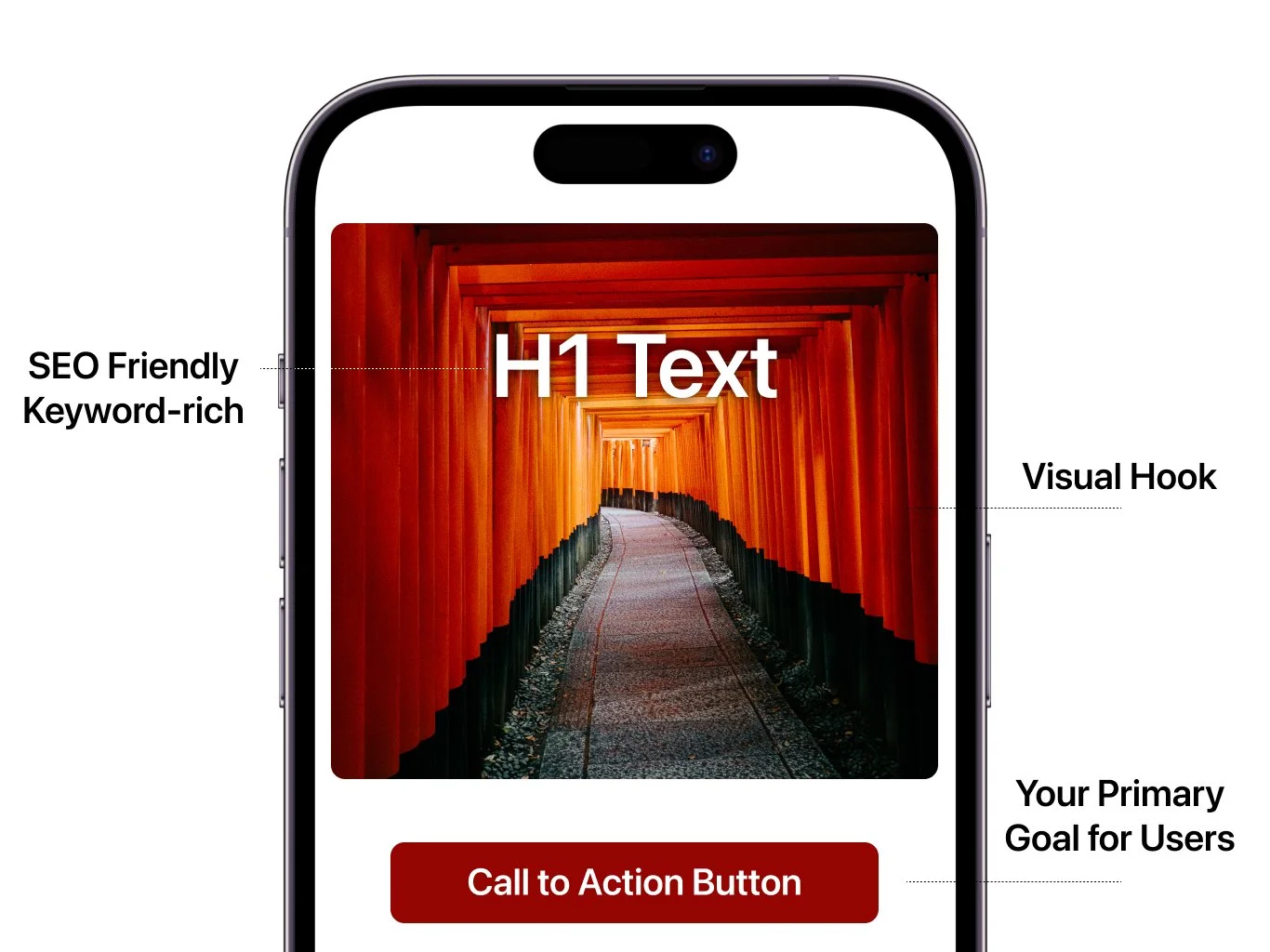
Craft a clear, keyword-rich headline that says what you do.
Add a visual hook—a strong photo, illustration, or short looping video.
Include a primary call-to-action (e.g., “Book a Free Consultation” or “Shop Now”).
Keep it lightweight—fast load times matter more than ever.
Don’t try to cram everything above the fold. It’s about clarity, not clutter.
Final Thoughts
Above-the-fold design isn’t about squeezing your entire brand story into a tiny space. It’s about making a promise—showing visitors right away that they’re in the right place, and encouraging them to keep scrolling.
At Jungl Studio, we design websites that balance form and function. By prioritizing above-the-fold strategy, we help brands stand out, rank higher, and convert more visitors into loyal customers.
👉 Want to see how your above-the-fold content stacks up?

