
10 Wellness & Spa Websites That Actually Book Clients (And What They Get Right)
The wellness industry has a website problem. Not a design problem. Most wellness sites look fine. The issue is that looking serene and performing are two completely different things.
A site that feels calm but has no clear booking path, vague service descriptions, or photography that could belong to literally anyone? That's a site quietly costing you clients. The ones below have figured something out: they create a feeling and they convert.
Here's what they get right, and how you can steal it.
What Makes a Wellness Website Actually Work
Before the examples, a quick framework. The best wellness sites consistently do five things:
They communicate transformation, not just the treatment. Clients aren't buying a massage. They're buying relief from a chronic back problem. They're not buying a yoga class. They're buying the version of themselves that can finally slow down. The best sites speak to that outcome first.
They earn trust before asking for a booking. Founder stories, credentials, real client results, press mentions. Trust has to be built on the page before someone hands over their time or money.
They make the next step obvious. Every page should end with a specific action, not just "contact us" but "book your first session" or "see what's available this week."
They use photography that actually reflects the experience. Generic stock spa imagery destroys trust faster than almost anything. Real space, real people, real light. That's what converts.
They're genuinely thought through on mobile. Not just "responsive" but actually considered for how wellness clients browse: from bed, a waiting room, post-workout on the couch.
Now, the sites that show all of this in action.
10 Wellness and Spa Websites Worth Studying
1. The Class
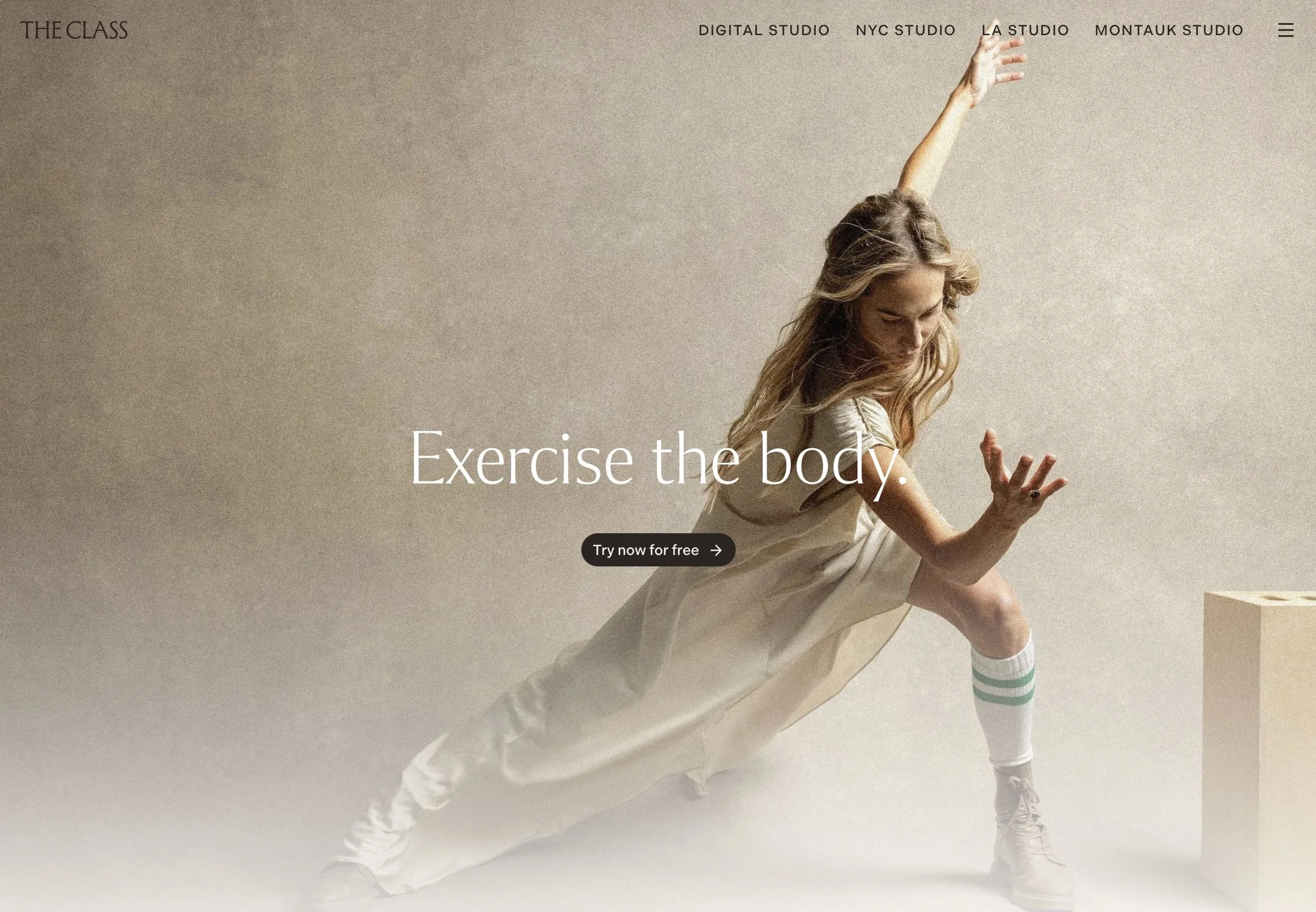
The Class is a somatic workout method: mat-based, music-driven, one move repeated per song, designed to regulate the mind through the body. Explaining that in web copy is genuinely hard. A workout that's also an emotional release practice could read as esoteric or alienating. Instead, the homepage is clean, focused, and oddly calming. The fading scroll animations feel intentional rather than flashy. They set a pace that mirrors the experience itself, and we love that. The site earns your interest before it asks for anything.
What this means for your site: If your offering is nuanced or unfamiliar (breathwork, somatic therapy, energy work, floatation), your site has to work harder to make it feel accessible without dumbing it down. The visual language, the pacing, the copy all need to pull in the same direction.
2. We The Conscious
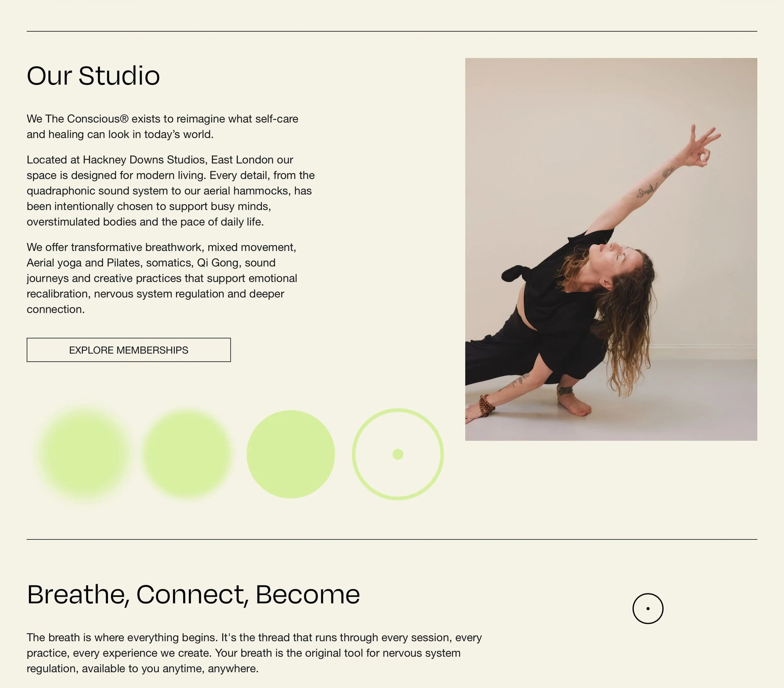
UK's only breath-led multidisciplinary studio, based in Hackney, East London. Breathwork, sound healing, movement, aerial yoga, hammock relaxation. Yes, hammock relaxation is a thing and apparently it's great for your vestibular system. The studio opened in 2025, which makes its brand maturity even more impressive.
What stands out is that it doesn't default to the beige-and-serif wellness aesthetic that's become basically a visual cliche. The design has a specific, grounded identity that says "this is for people who take their wellbeing seriously but don't want to feel like they're at a spa retreat." That distinction is doing real conversion work.
What this means for your site: If your site looks like every other studio in town (muted tones, soft serif fonts, vaguely green imagery), you're blending in rather than standing out. A distinctive visual identity is a positioning tool. Full stop.
3. HAVN Saunas
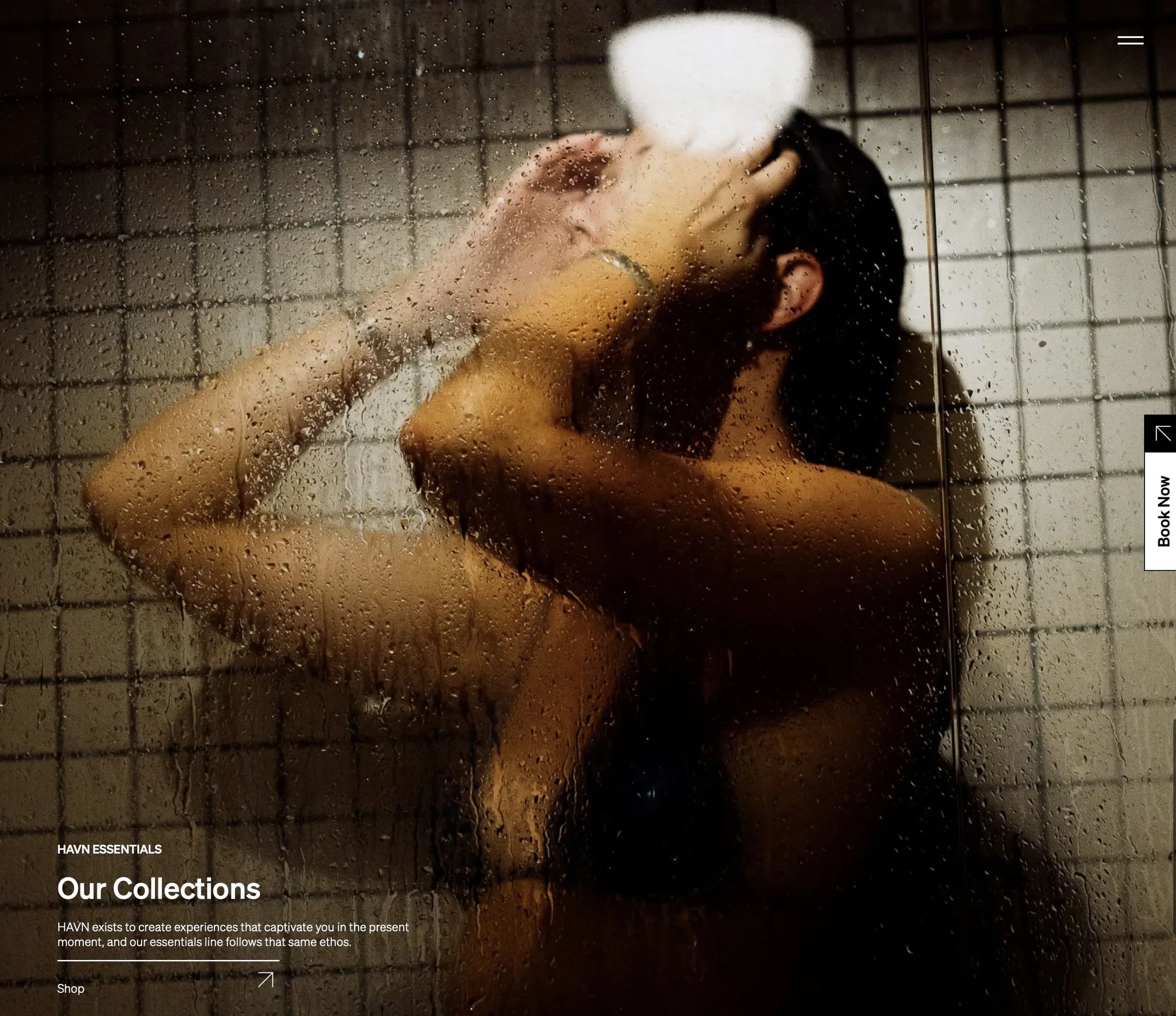
A floating sauna and hydrotherapy experience built on a restored 1943 naval vessel in British Columbia. Read that again. The concept alone creates curiosity, and the site earns it.
What HAVN does well is lead with mission before logistics. You understand why this thing exists and what it believes about rest and urban life before you ever see a booking calendar. There's a quality to the brand that feels genuinely built by people who believe in what they're doing. That belief comes through in every design decision, and that's hard to fake.
What this means for your site: The "what we do" is easy to communicate. The "why we exist" is what creates connection. If your about page or homepage doesn't answer the second question, you're leaving something important on the table.
4. Circle Wellness Spas
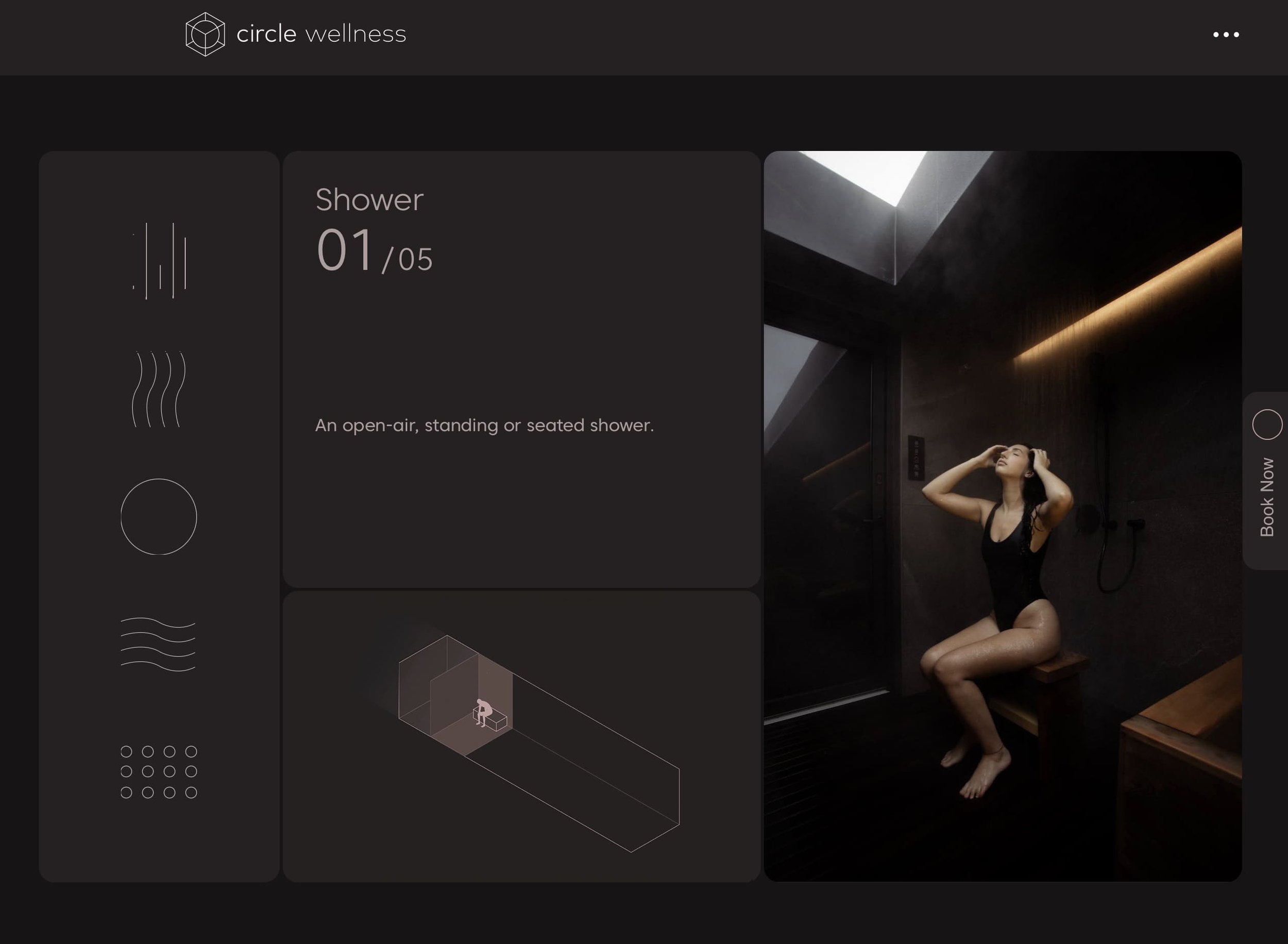
Circle describes itself as the world's first private thermal spa experience built inside a prefabricated container. Based in Vancouver, expanding to Seattle. Sessions are 90 or 120 minutes, self-guided, designed for one or two people. Prices run $225 to $295, presented clearly and without apology.
That confidence is actually the thing we'd highlight here. The site doesn't hedge. It doesn't say "rates vary" or "contact us for pricing." It tells you what it costs, what you get, and how to book. That clarity is a form of brand positioning, and for a premium service, it's the right call.
What this means for your site: Hesitant pricing copy ("starting at" or "reach out to learn more") signals insecurity. If you're a premium wellness offering, presenting your prices clearly and confidently is how you attract the right clients and pre-qualify the ones who aren't a fit.
5. Sacred Space Miami
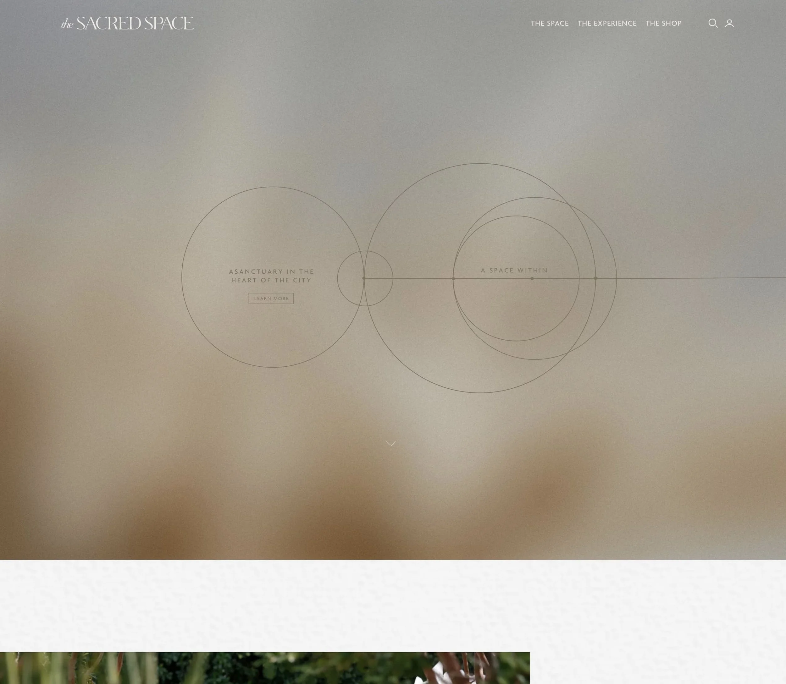
A holistic wellness center, regenerative organic farm, modern farmacy, and non-profit foundation. All in one. Founded by Karla Dascal, whose personal story and values are visible throughout the brand from the first scroll.
The site does something genuinely difficult: it holds real complexity without feeling cluttered. Four distinct entities, one coherent visual identity. The animation is used purposefully rather than just for decoration, and the whole thing feels like a living brand rather than a website that got built once and never touched again. Also, "Modern Farmacy" is a great name and we're a little jealous of it.
What this means for your site: If you offer multiple services, your navigation structure is doing more work than you probably realize. Visitors shouldn't have to figure out where they are or what you offer. A clear information architecture, before any visual decisions are made, is what keeps complex wellness brands from losing people in the first thirty seconds.
6. Alma Studio
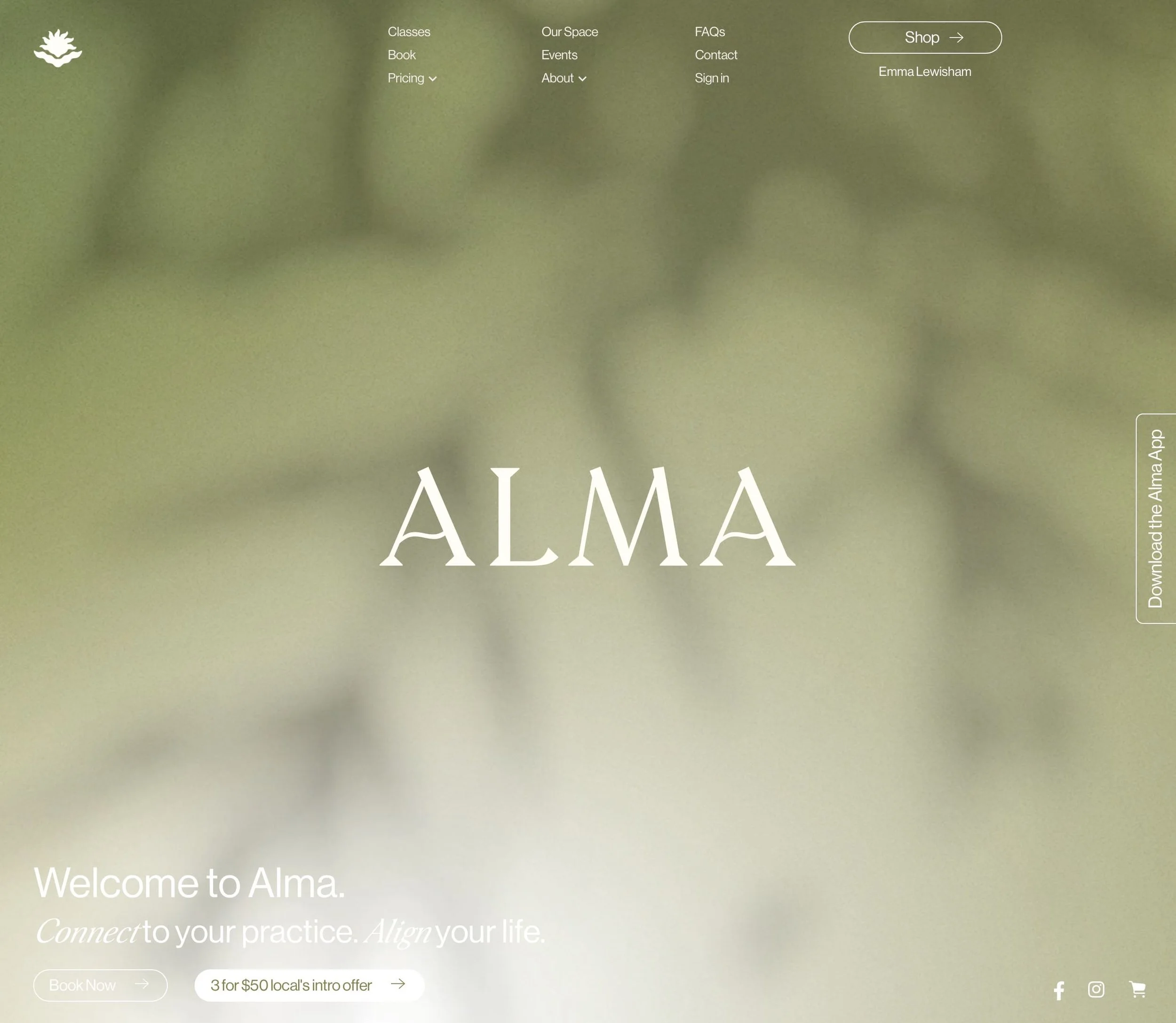
Yoga, Pilates, and meditation in Havelock North, New Zealand. Small, local, and genuinely excellent online. Which honestly is not as common as it should be.
The thing Alma gets right is the people content. One instructor trained with the Royal New Zealand Ballet for a decade before a knee injury redirected her to Pilates. Another discovered yoga through her grandmother. These aren't boilerplate bios. They're stories that make you want to train with these specific people. The photography and color palette are calm and cohesive throughout. It's a site that feels like someone cared when they built it.
What this means for your site: Your team bios are probably one of the most visited sections of your site, and they're almost certainly underperforming. Generic credentials plus a headshot won't do what a real story will. The more specific and human the "About" content, the more trust you build before the first booking.
7. Hale Now
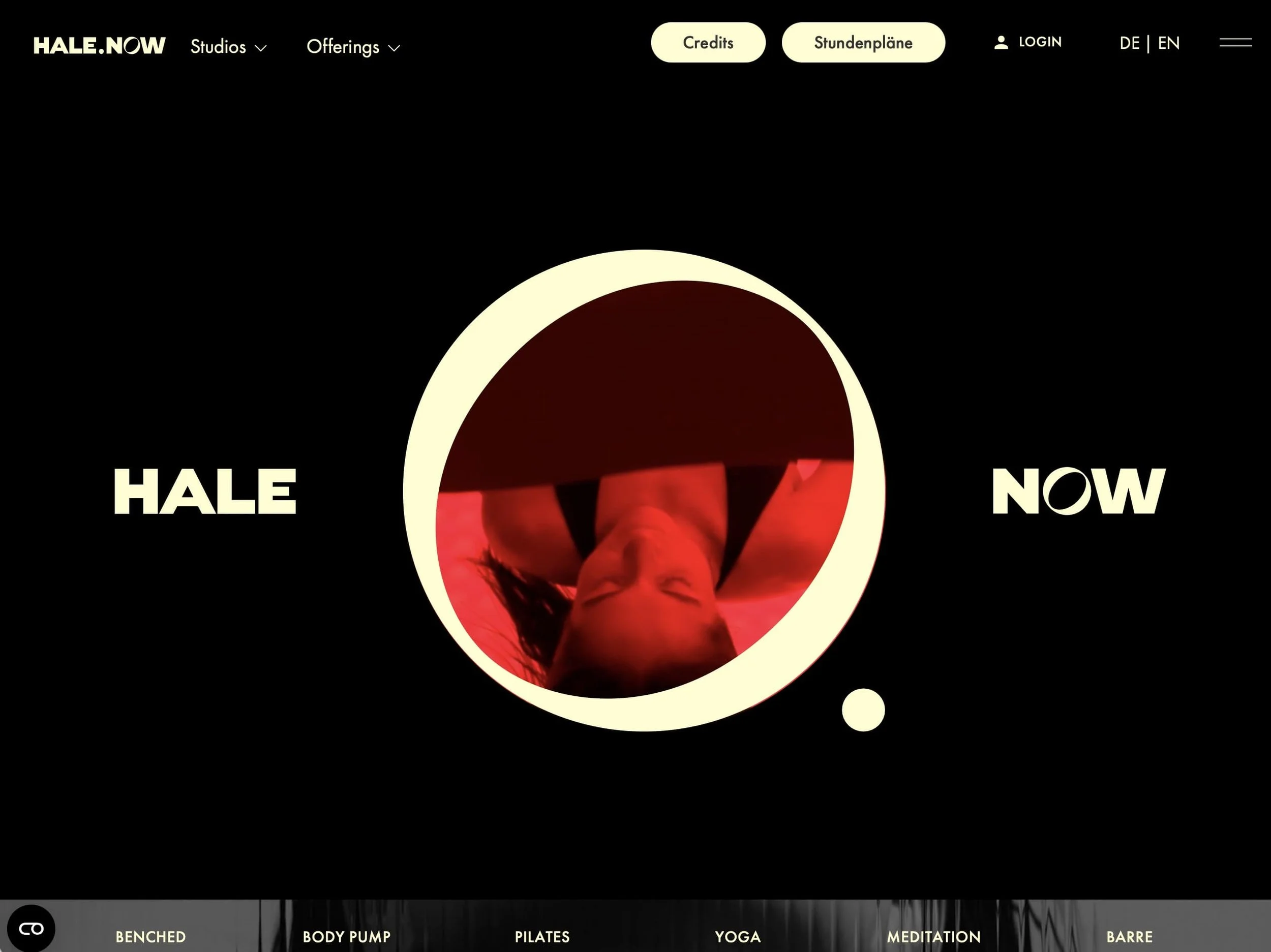
Five wellness studios across Berlin: yoga, Pilates, Reformer, events, retreats, coaching, and an online magazine. Kyle flagged this one as "big company, great inspiration," and that's the right framing. It's a larger operation than most independent studios. But the design principles scale down perfectly.
The site manages to make a multi-format wellness brand feel coherent rather than scattered. The visual system is consistent, the class discovery is clear, and the brand feels like a genuine lifestyle rather than just a gym with a nice logo. The multilingual functionality (German and English) is handled cleanly too, which, as a Hamburg-based studio, we appreciate.
What this means for your site: A strong visual system, consistent fonts, a defined color palette, intentional spacing, makes even a solo practitioner look like a brand worth trusting. Most independent wellness businesses underinvest here. The return on a cohesive visual identity is disproportionate to the cost.
8. Othership
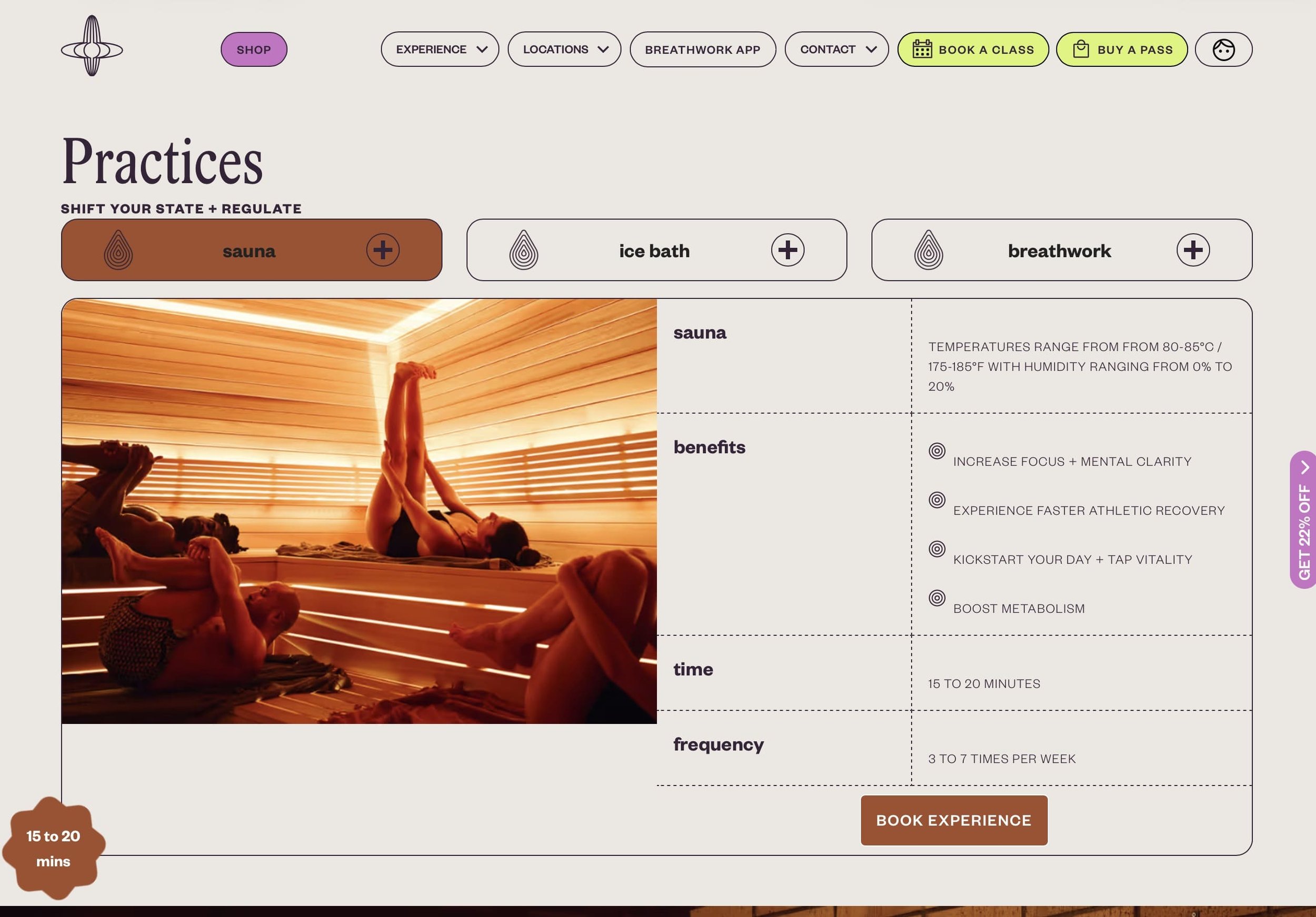
Breathwork, cold and heat therapy, and community. Started in Toronto and expanded into digital programming. Othership has done something genuinely hard in the wellness space: they've taken the sauna-and-cold-plunge format and given it an actual culture and community identity, not just a service menu.
The visual language is warmer and more human than the clinical aesthetics that tend to dominate the thermal wellness category. The copy earns its emotional register instead of just throwing around words like "transformation" without backing them up. A brand can say "this will change your life" or it can show you exactly how. Othership goes with the latter, and it works.
What this means for your site: If you have a real community (returning clients, a recognizable studio culture, regular events), your site should make that tangible rather than just claiming it. Photography, testimonials, and event presence do this work better than any marketing copy ever will.
9. Remedy Place
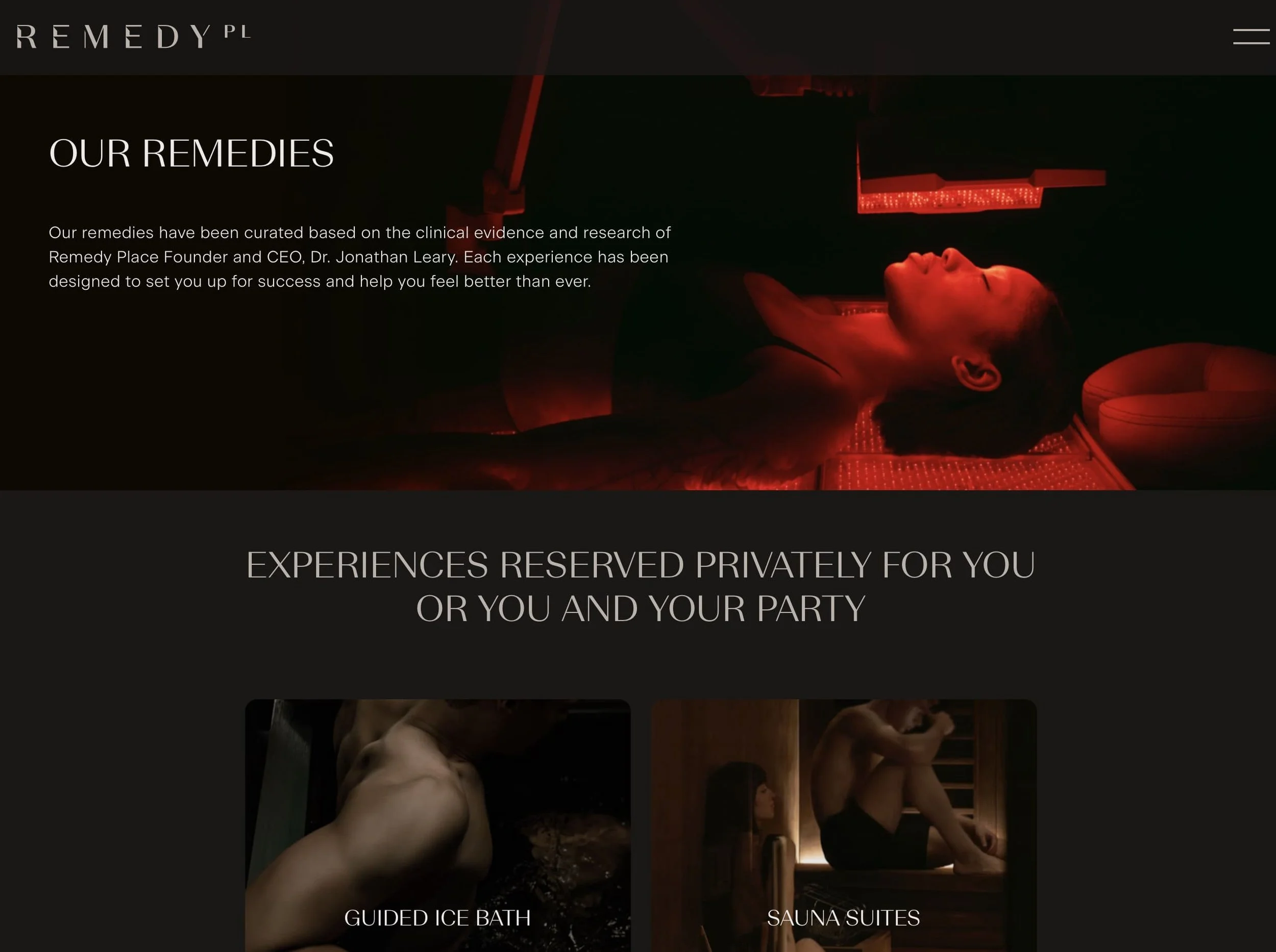
"The world's first social wellness club," with locations in New York and LA. Built on the idea that recovery and wellness should be communal rather than solitary. The site carries that positioning clearly: it doesn't feel like a spa menu, it feels like a membership to something worth belonging to.
The brand is confident enough in its concept that it doesn't over-explain. It trusts the visitor to lean in. Service pages are clean, photography is specific and editorial, and the social dimension of the brand comes through without being forced. It feels like a place that exists for a real reason, not just because someone had startup capital and a cold plunge obsession.
What this means for your site: Membership and recurring client models in wellness need sites that communicate belonging, not just service. If you offer packages, memberships, or a returning client relationship, the site should feel like an invitation to join something, not a price list with a booking button attached.
10. Bodyism
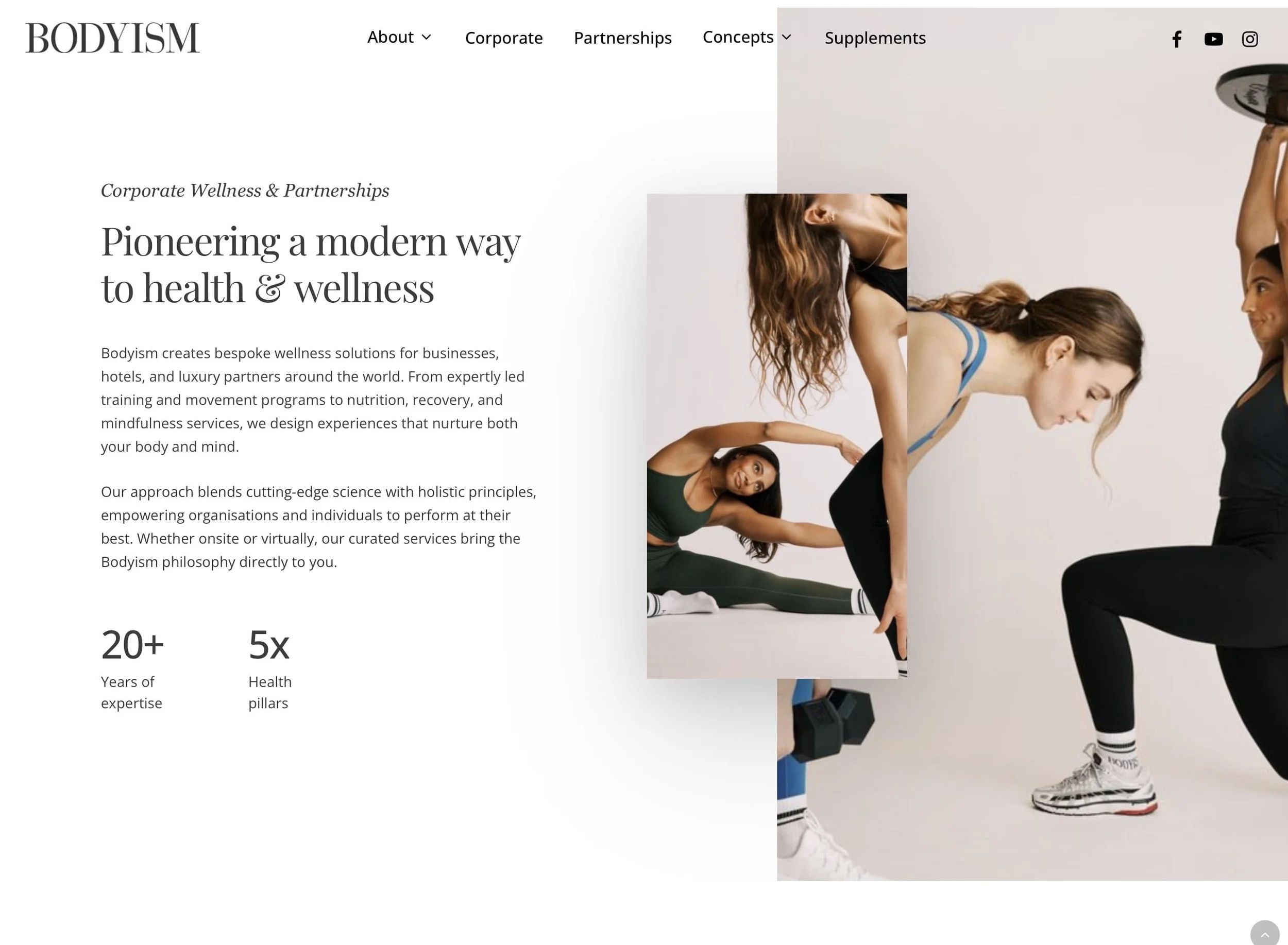
Founded by James Duigan in London. Personal training, retreats, nutrition, apparel, lifestyle content. The site holds all of that without losing its premium positioning, which is genuinely hard to do. What's notable is how editorial the whole thing feels: it reads more like a high-end lifestyle publication than a gym website, which creates desirability that most wellness sites just don't reach. Everything, the typography, the photography, the copy tone, signals the same price point. Nothing undercuts the brand.
What this means for your site: Your site's design quality signals your positioning before a visitor has read a single word of your pricing. If you're a premium wellness offering, your site should look like one. Clients are making quality judgments before they've even found your services page.
So, How Does Your Site Stack Up?
Quick diagnostic. Be honest with yourself here.
Does your homepage communicate the outcome of your service, not just what it is?
Can a first-time visitor figure out how to book in under 10 seconds?
Does your photography actually reflect the experience of being in your space?
Does your brand look distinct from other wellness businesses in your niche?
Do your team bios tell real stories, or just list credentials?
Is your pricing presented clearly and confidently?
Does your mobile experience feel genuinely considered?
Three or more "no" answers means your site has room to do more for your business. That's not a critique, it's just an opportunity.Ready to See What's Actually Holding Your Site Back?
We do free website reviews at Jungl Studio — no pitch, just an honest 10-minute look at what's working and what isn't. If you're a small business owner who suspects your site isn't converting the way it should, book a free review here or see our web design work.
Most of the businesses above didn't start with perfect websites. They just worked with people who understood what good looks like, and had the design chops to get them there.
Your Wellness Brand Deserves a Site That Performs
The sites above don't just look serene. They communicate the right things to the right people at the right moment in the browsing journey. That's what turns impressions into bookings.
At Jungl Studio, we build wellness and spa websites on Squarespace that establish your brand, tell your story, and give clients a clear path to booking. Whether you're a solo practitioner, a boutique studio, or a multi-format wellness center.
Get a free website review if you want honest feedback on what's working and what isn't. No pitch, just a real look at your site.
Or if you're ready to talk: Book a discovery call
More in This Series
This is part of our Web Design Inspo series, a running look at the best websites by industry and what small businesses can learn from each.
Coming up:
Top Restaurant and Hospitality Websites Done Right
The Best Creative Studio Websites for Winning Clients
Top Local Service Business Websites Worth Studying
Drop a comment if there's a wellness site you think belongs on this list. We're always looking.